- Home |
- Work With Us |
- Cover Design Award |
- 2022 Shortlist |
- Children’s shortlist
Children’s shortlist
Cassia Samson - Winner
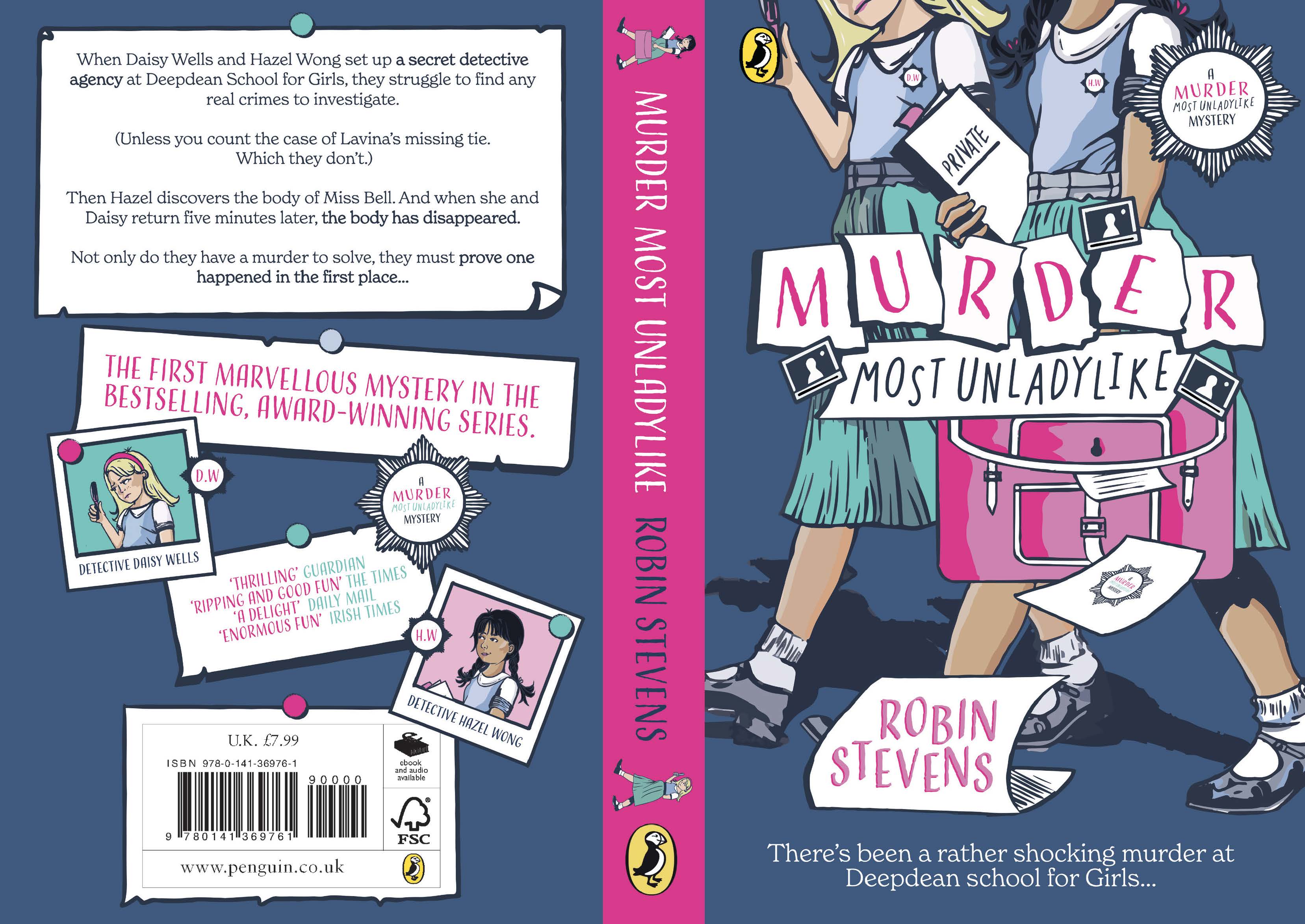
Whilst reading the book, one of my favourite parts were Hazel’s notes, it brought a sense of fun. As it is written in Hazel’s perspective, her note-taking role is an integral part of the story and narrative, so my concept stemmed from that. The focus of the cover concept is the note and paper. With the papers falling from her briefcase, it sets up Hazel's role, indulging in the sense of mystery with her ‘PRIVATE’ book. I wanted the illustration to reflect the 1930s when it is set, inspired by covers of Enid Blyton’s books. The colour palette was important to make bold and complimentary, and I also wanted the girls to be dressed in 1930s English boarding school clothes to help visualise the characters but leave a sense of mystery by not revealing their faces until you turn to the back.
Judges comments:
‘This has so many wonderful details! I love the lettering of the title, the bright colour palette and the way it showcases the friendship and connection between my two heroines. The cover reads as both a school story and a children's murder mystery, and I can really see where it would sit in bookshops. Well done!’
Robin Stevens, author and guest judge
‘Congratulations! A brilliant and very accomplished design. It cleverly depicts the friendship and period setting of the book in a contemporary way that will appeal to the target audience. Smart use of colour with perfectly weighted combinations and connections between the multiple elements. The development from initial design to finished cover was spot on, making it a very much deserved winner’
Anna Billson, Art Director – Penguin Random House Children’s
‘This is a wonderful, confident, cover that captures the spark of the story beautifully and calls out, Pick Me Up! You’ve created a very accomplished striking design, that’s also full of fun and child-appeal. I love your title type, the logo design, the use of colour with the hot pink satchel. Congratulations on your first prize!’
Francesca Dow, Managing Director – Penguin Random House Children’s
‘Well done for you successful design entry. You met the brief really well, with your colour pallet and dynamic illustration. The type works wonderfully with the image and leads you all the way to the author title. Your series logo is really playful too.’
Nina Tara, guest judge
Charlotte Jones - 2nd Place
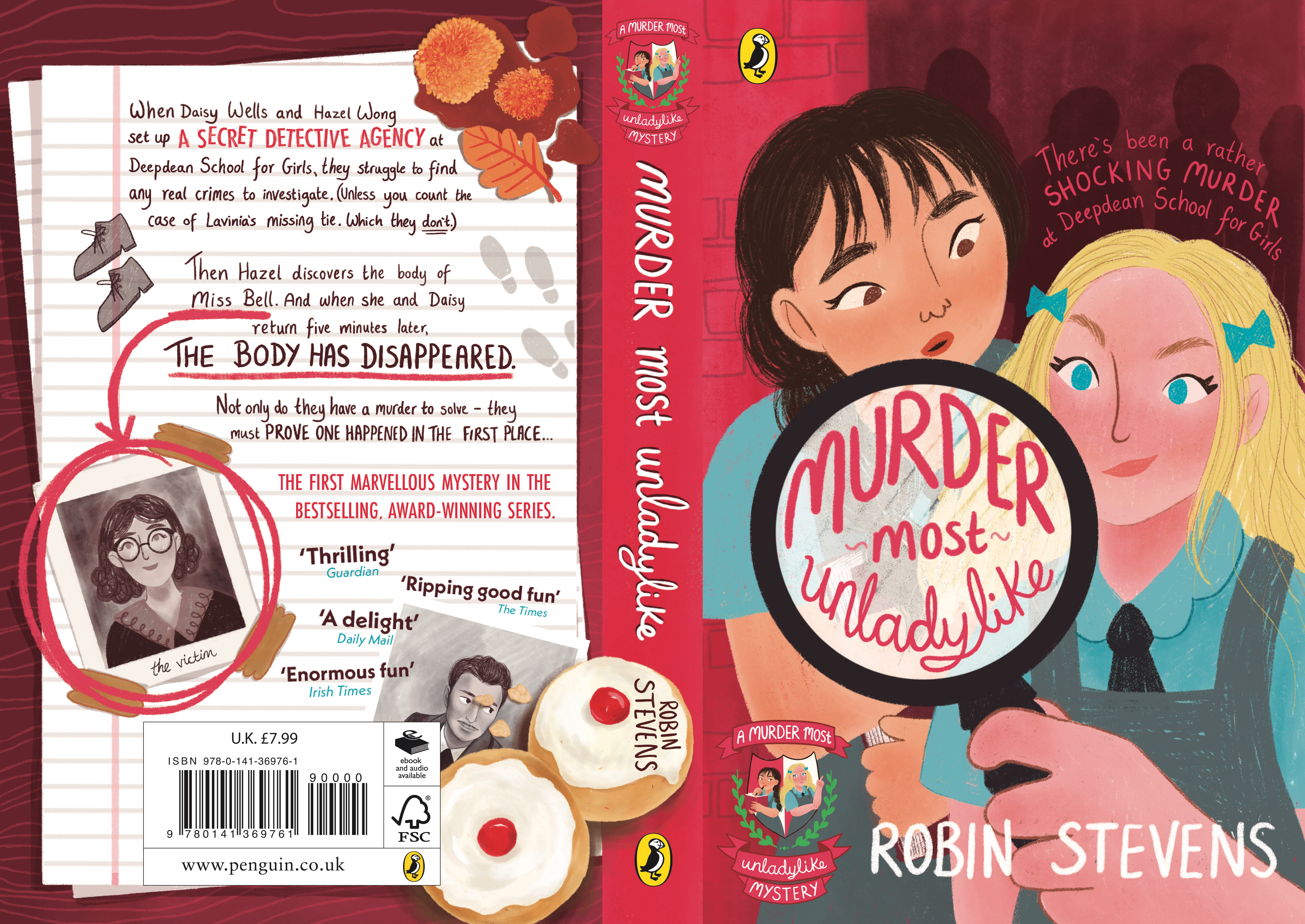
My design places the reader right into the action and instantly connects them to the close relationship between Hazel and Daisy. Placing the title within Daisy’s magnifying glass emphasises that if it wasn’t for the Wells & Wong Detective Agency, nobody would even know a murder took place. Comparing themselves to Holmes and Watson, I took inspiration for the looming background figures and typography from 1930s Sherlock Holmes posters which helped to add a sinister undertone to the otherwise playful composition. As Hazel is narrating the story, I designed the back cover as though it were a page from her case notes alongside buns for herself and Daisy – the fuel of detectives.
Judges comments:
‘I adore the way Daisy and Hazel and their friendship are depicted - it's beautifully done, and Charlotte has real talent as an illustrator. The back cover, with the delicious buns and the teachers' mugshots, is also a delight - this cover has such promise and I was very impressed with it’
Robin Stevens, author and guest judge
‘Congratulations! Such a fun cover with a very striking image that instantly draws you in and makes you want to get to know the characters. Love the bold use of colour and the fun way you have packed in so many details across your design’
Anna Billson, Art Director – Penguin Random House Children’s
‘We were impressed and struck by your characterisation: you’ve really brought the girls alive in this warm and appealing cover. I love all the details (the cream buns on the spine) and your back cover is clever in incorporating so much of the necessary copy with your imaginative use of illustration and design. Many congratulations!’
Francesca Dow, Managing Director – Penguin Random House Children’s
‘Well done on meeting the brief with your successful cover design. The illustrations of the girls are wonderful and I was stuck with the way you captured their diversities. A really playful and dynamic cover’
Nina Tara, guest judge
Rebecca Sheerin - 3rd Place
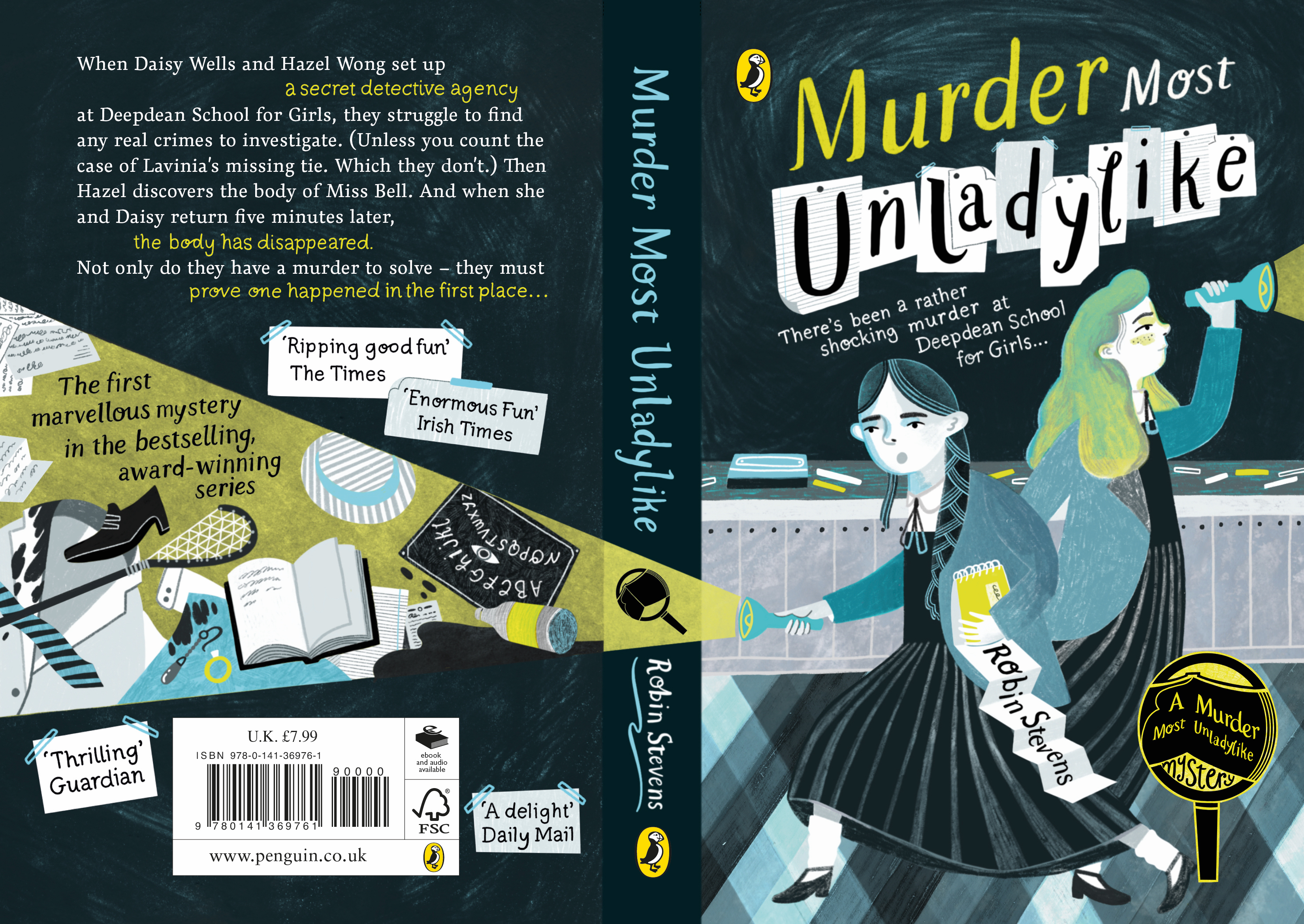
My design focuses on the puzzle of a murder mystery rather than the murder. In the torchlight there are clues that Hazel and Daisy find along the way and red herrings so that readers won’t know what was really important until the truth is revealed. I also wanted to focus on Daisy and Hazel’s relationship, they are facing away from each other as throughout the book they follow their own path but in the end they are always, back to back, a detective team.
Judges comments:
‘A really confident and bold cover that draws the eye. The torchlight across the back cover and spine made this entry stand out, and I really thought Rebecca conveyed the quirky spookiness I was going for with my book!’
Robin Stevens, author and guest judge
‘Congratulations! A beautifully balanced design which packs in so much detail while making great use of a striking limited colour palette. The design runs seamlessly from back to front with clever graphic devices connecting all the elements.’
Anna Billson, Art Director – Penguin Random House Children’s
‘This is a beautifully conceived cover: such an accomplished design, in its scope and detail. You’ve captured the period feel of the books brilliantly. Many congratulations!’
Francesca Dow, Managing Director – Penguin Random House Children’s
‘Well done on your successful cover design entry. You thought through how the type would work with the illustration and together they create a really accomplished cover design’
Nina Tara, guest judge
Hannah Barry
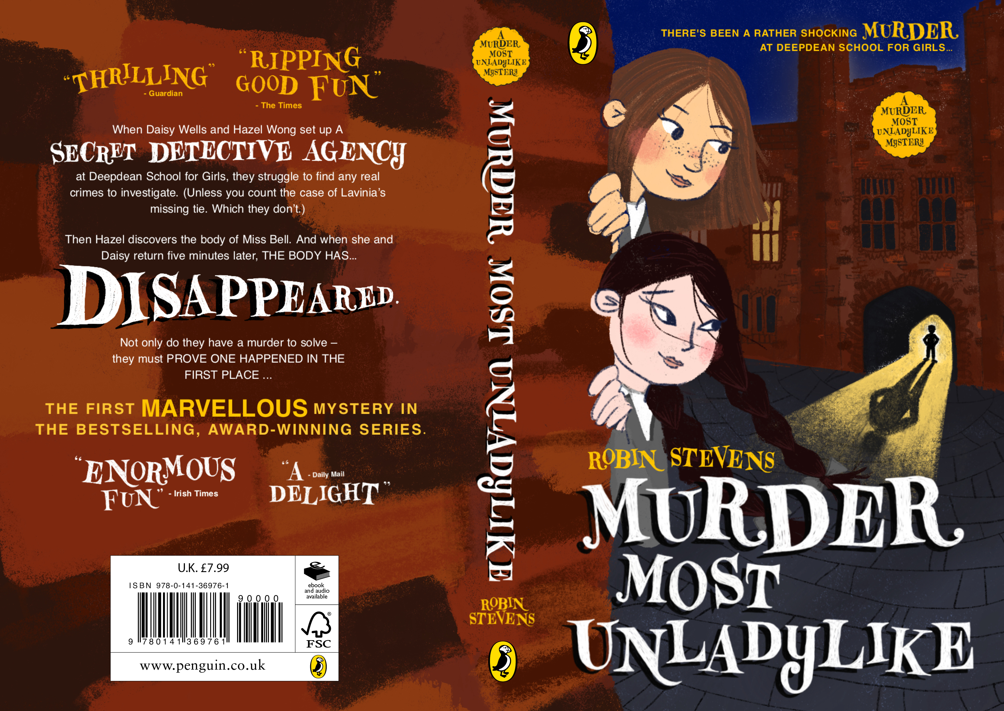
I wanted the characters to be the focus for this cover. The sense of mystery comes from the shadowy figure in the doorway – reinforcing the story for the audience. I used a bouncy hand-drawn typeface for the title and some of the blurb. I love character design, so definitely wanted to play around with the two main characters for the front cover. My favourite books growing up were Malory Towers – I took some inspiration from the redesign of these covers by Pippa Curnick, and some general ideas from other children’s detective novels such as Ottoline by Chris Riddell.
Asimina Hollingworth
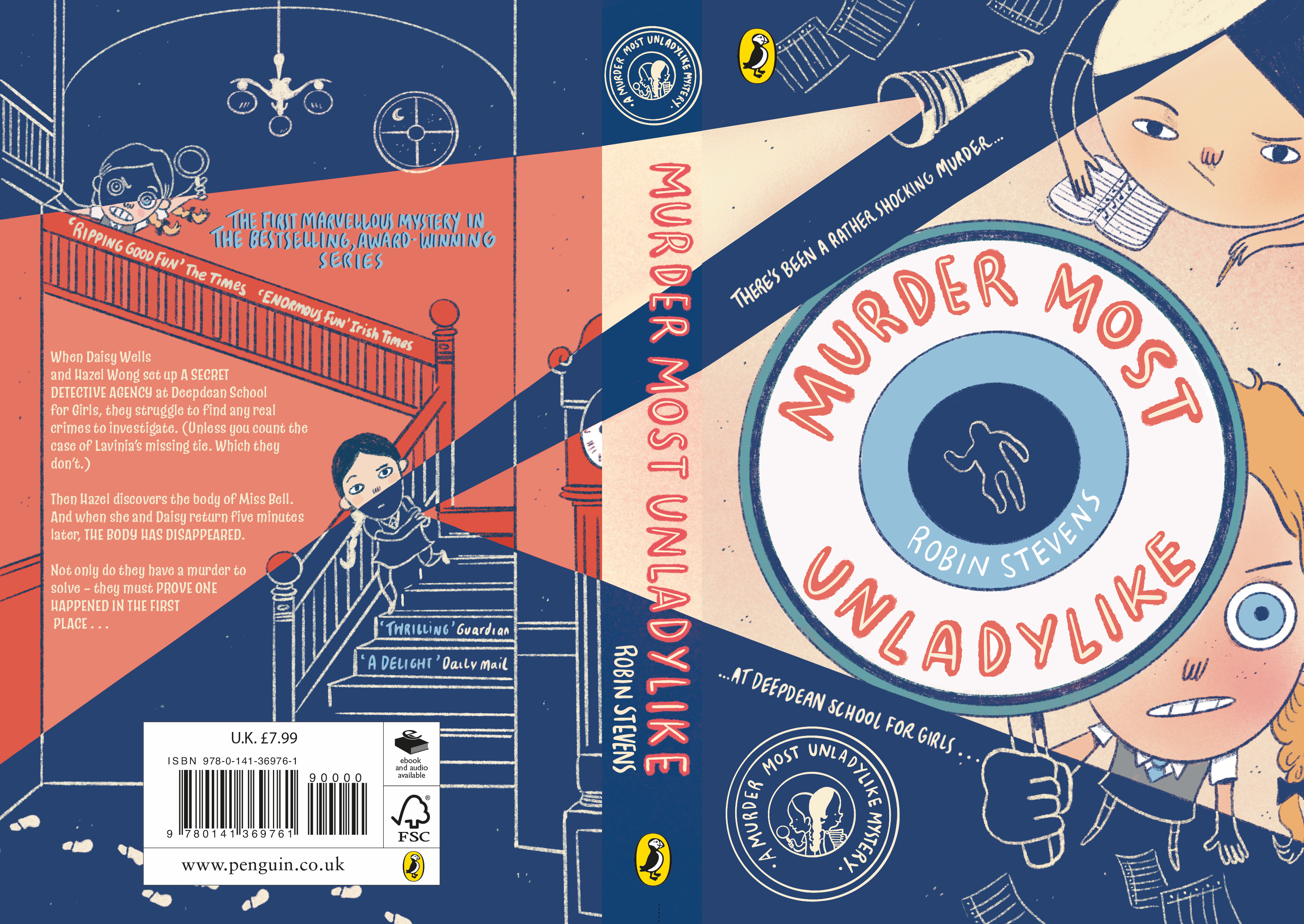
The magnified eye pivots the viewer around the angles and spotlights spanning across the front and back cover. Daisy’s stance is determined and assertive, as is her nature within the novel – whilst Hazel peers from her casebook. Having Hazel write would suggest the narrative voice and style of the book. The torch spotlights the back cover, where there is a reciprocating source leading us to the front. I incorporated these two flashlights as a reference to the detective roles of the girls, and the juxtaposing line art and colour illustrations illuminate the contrast in their personalities – and their overall synergy.
Georgie McAndrew
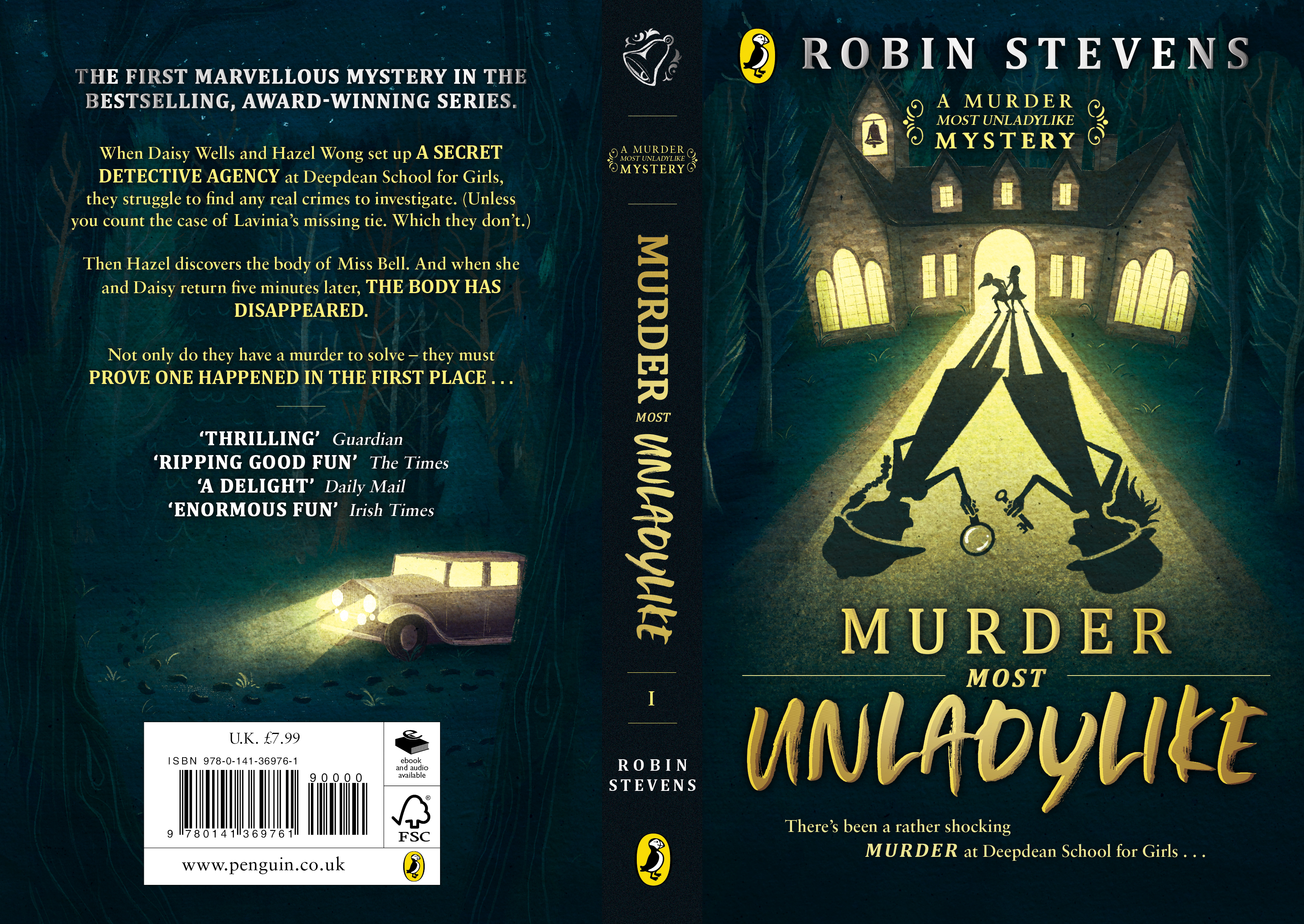
As this is just the first book in a series of ten, I chose to focus on environmental design so that each book in the series is unique to the individual setting of each story while remaining cohesive as a set. That way, the girls remain consistently striking across the series while the backgrounds give hints to the reader about what each book is about, with our leading ladies of course in the limelight!
Shannon Murphy
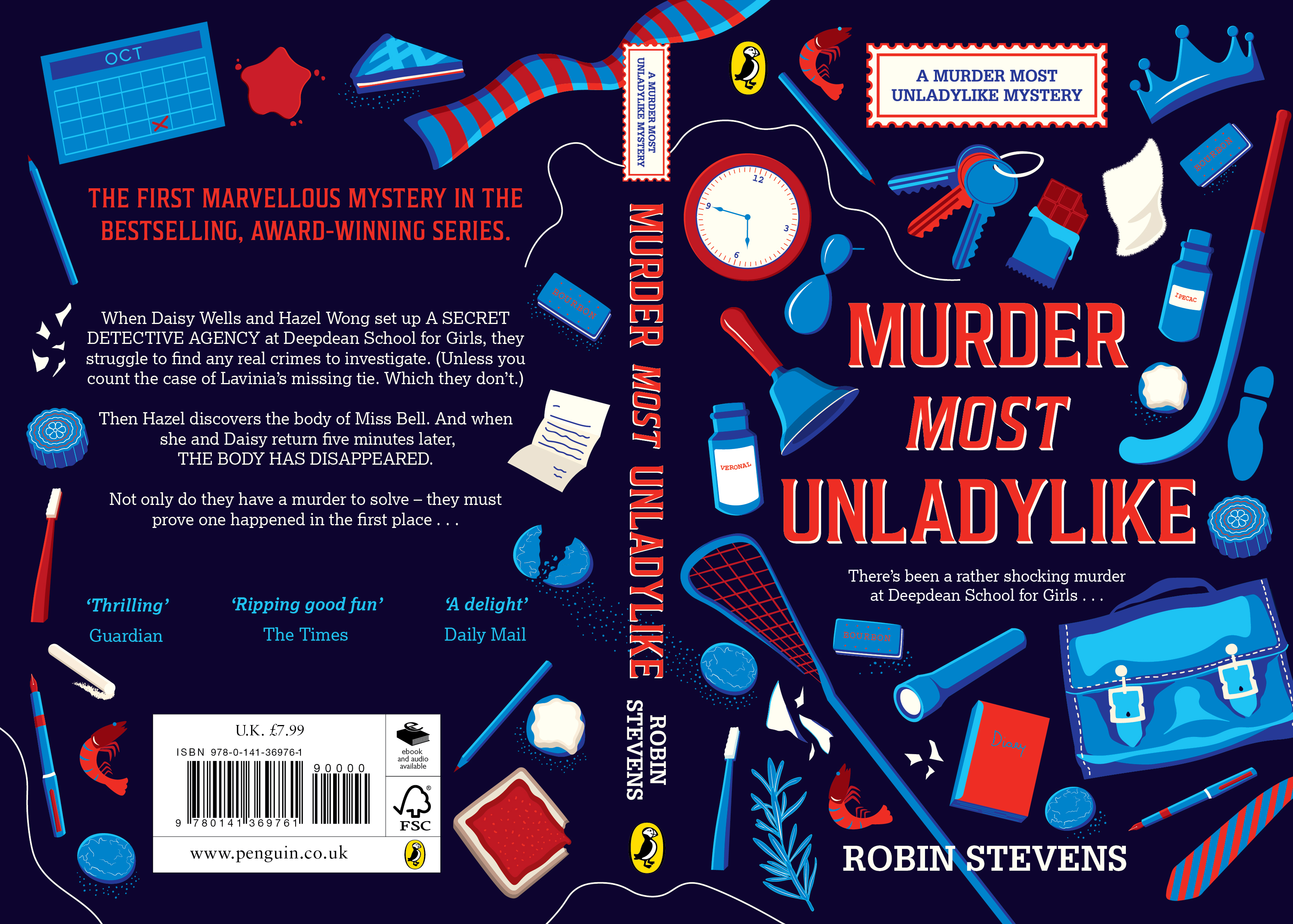
The cover design is inspired by the murder mystery. As Hazel Wong and Daisy Wells work to figure out who the murderer is, they riffle through Deepdean School, finding some important clues that crack the case amongst the many objects of daily school life. I imagined Hazel making sketches of all of these in her casebook. The book cover is designed to entice the reader to come back to the cover and look for the important clues amongst the many insignificant objects, and finally have an “oh, that’s what that means” moment when they find out who the murderer is.
Leticia Ribeiro
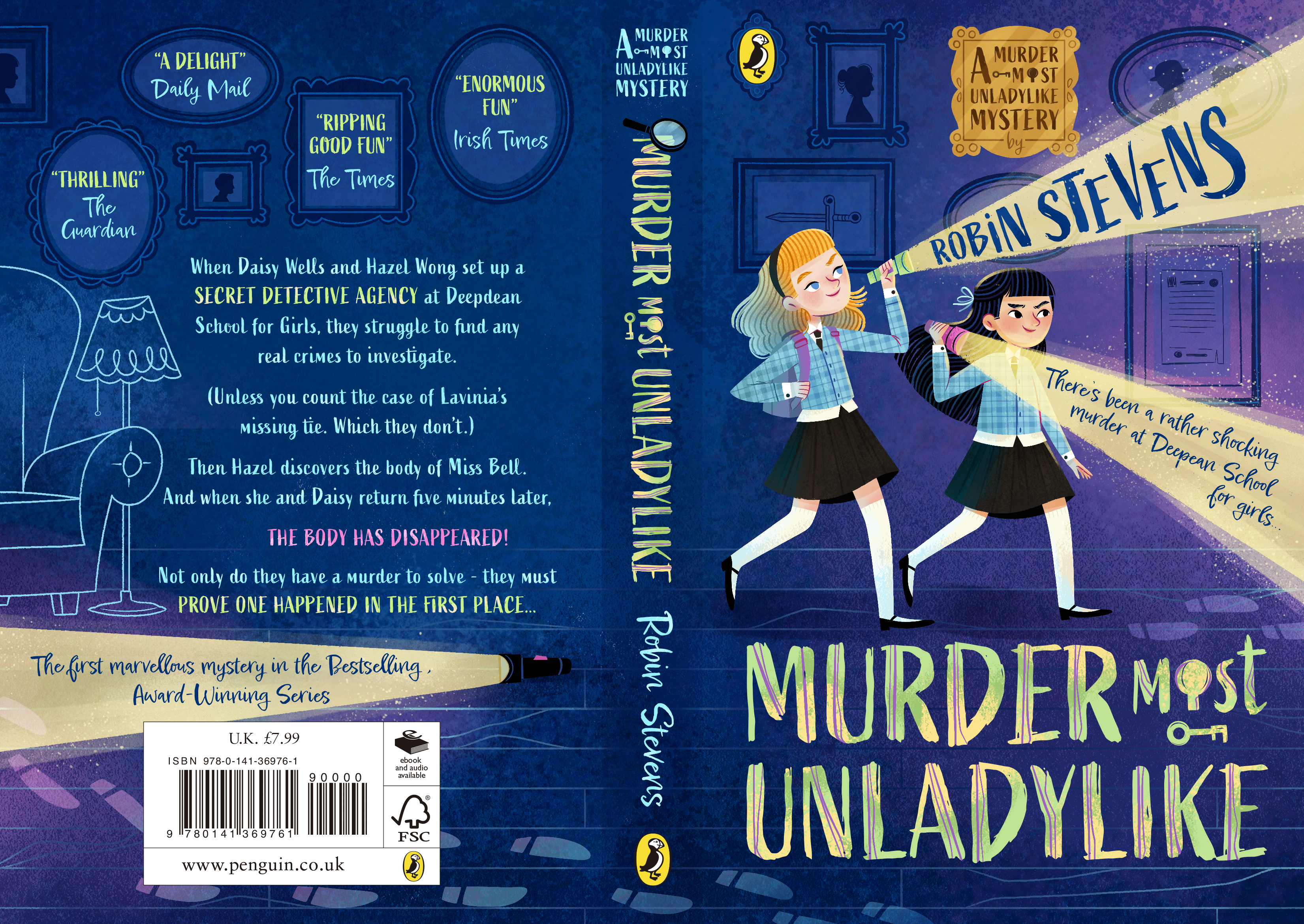
My initial concept for the cover design is based on the idea of the darkness and all the mysteries it hides. I couldn't stop imagining the two main characters sneaking out of bed, running through the school's corridors at night, seeking hidden clues that only they were searching for. The idea was to convey the fact that despite the night always trying to cover up the killer's footprint, there will always be two courageous girls to bring light to the truth.
Abbie Winson
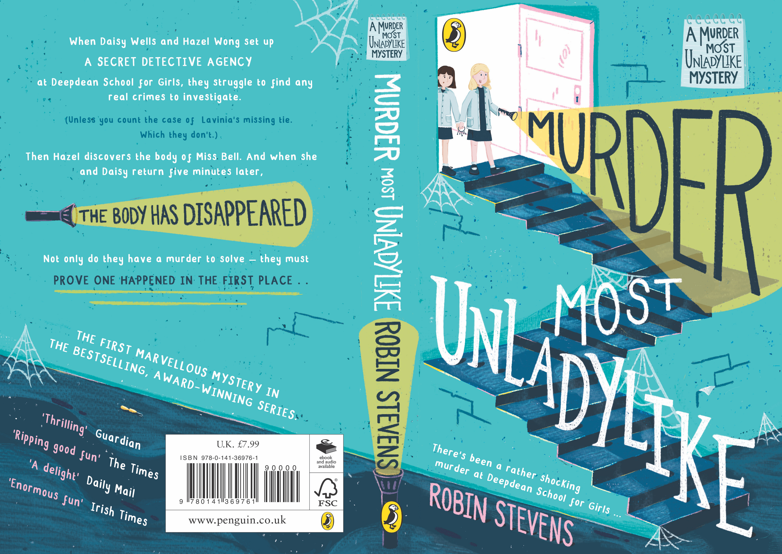
The cover is designed to show both the mystery and also the fun side to this book. I believe the use of the blues, the spark of yellow and pink achieve this and would attract the audience. I wanted to be able to reward the attentive readers by including hints on the cover that do not give too much away until you start reading it, giving a layer of interactivity within the design. I showed the scale between the girls next to the stairs to show both their relationship and the big investigation that is unfolding.
Niharika Yellamraju
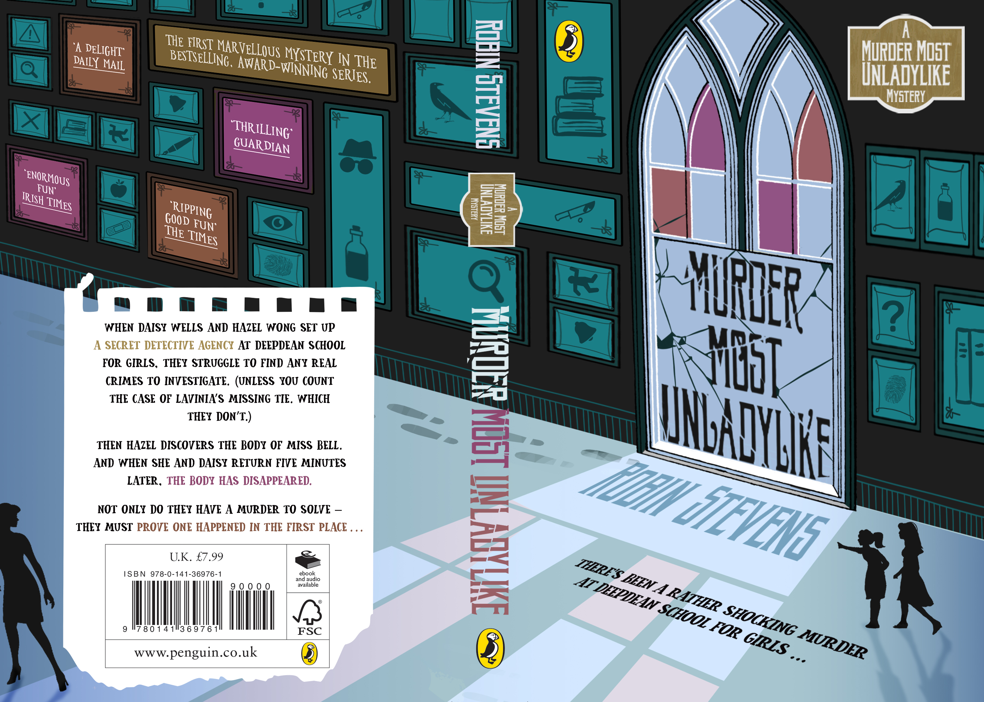
My design reflects Murder Most Unladylike as it would look if you were at the crime scene depicted within the story. It takes you through the journey as the girls notice the missing body. I took inspiration from old architecture and large intricate windows, which mirrors the beauty of the time period the book is set in. To achieve a more intriguing look, I made use of colours and light to set the mood of the evening, with subtle hints and clues set within the surrounding, atmospheric environment.