- Home |
- Work With Us |
- Cover Design Award |
- 2024 Shortlist |
- Children’s shortlist
Children’s shortlist
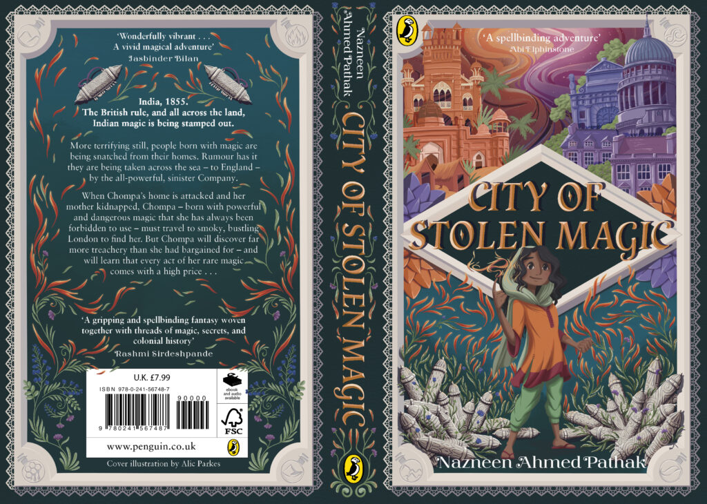
City of Stolen Magic by Nazneen Ahmed Pathak
1st prize, Charlotte Jennings

I focused on using colour and shape language to convey the essence of Chompa's journey from beginning to end, using a spiral composition to guide the viewer’s eye around the cover. I used orange hues to depict the warmth and familiarity of India along with its connection to Chompa’s fiery magic. All is silhouetted by the complementary blue colour of the sea and the date palm, pointing directly at the mysterious, cooler-toned city of London. At the centre of it all is Chompa, wrapped up in this chaotic adventure full of intrigue and magic.
I was really touched by the amount of care and attention everyone shortlisted had devoted to the world and characters – and there were so many original, creative approaches to the brief. The winning entry, however, stood out immediately for me. It's such a strong, graceful cover, and I loved Chompa's expression of serious intent, which encapsulates her character and draws me in.
Nazneen Ahmed Pathak, author of 'City of Stolen Magic'
A very much deserved win for a very accomplished design. The smart use of colour and the considered balance between the multiple illustrative elements combine to make a striking and inviting cover which opens up the world inside the book. The development from the initial submission to the final design has been really well executed, showcasing a strong design eye for both illustration and typography. Congratulations Charlotte!
Anna Billson, Art Director, Penguin Random House Children's
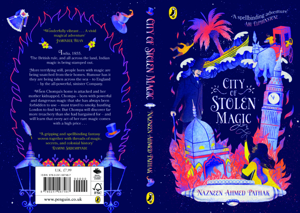
2nd prize, Evan Connolly

I wanted to create the contrast of the vibrant magic of Chompa’s home in India with a dark and imposing London. The silhouette of London is cast in black against a colourful tapestry of Indian patterns showing the magic is an outside resource being brought into the city. Conversely, the silhouette of India on the back cover is made of this pattern with a black shadow looming over it, suggesting the threat that colonial England is to the land.
A confident and beautifully balanced design. The striking contrast between the black silhouettes and the detailed illustrative patterns connect perfectly to draw the eye, allowing the image of the character to pop. The graphic devices run seamlessly from front to back in an effective cohesive design. Congratulations Evan!
Anna Billson, Art Director, Penguin Random House Children's
3rd prize, Karin Keratova

I wanted to capture important themes like unity, diversity, magic and colonial history all in one design. Chompa is standing together with her friends, with her magic creating the title itself to symbolise her confidence and the strength of unity. Together with Tipu, they are centring the British Museum with both of their magic, keeping colonial history a core focus. To add a further sense of unity and diversity, people of different cultures are holding hands above London. I focused on keeping significant colours like purple and blue but made it very colourful to capture the magic of the story.
A bold design with an engaging illustration which packs in so much detail while making great use of a limited colour palette. The characters instantly draw you in and the decorative elements evoke the magic in the story. Congratulations Karin!
Anna Billson, Art Director, Penguin Random House Children's
Alic Parkes
There is something quintessential in the childlike wonder of magical powers. This story represented that, and how we must all learn to master our gifts. Chompa is fiery and impulsive, but still driven, which drove my design. The split between her home and the new world she must travel to while learning to control her growing powers led me to focus on the native plants turning into fire, with the taviz as a reminder of her purpose. It's a story of growth as much as adventure, and I aimed to represent this in a bold, exciting design.
Andrea Davidsen

After reading the entire book, I began to take notes and sketch ideas based on what I found most interesting. I liked the idea of magic and where two cultures meet. The protagonist has a strong and determined personality and travels on a dangerous journey. So I drew the protagonist unleashing her magic in all sorts of bright colours and her white shawl becoming one with the wild ocean that she must cross to an unknown part of the world.
Daisy May Nash
The concept for this book cover design takes inspiration from the contrast between two worlds i.e. 1850’s India and England but also the line between humans and djinn which is referenced throughout the book. This is represented with the contrasting oranges and yellows to represent, fire, magic, bravery and the colourfulness of India and blues to represent indigo, The East India Trading Company, the villains’ lack of magic or joy and the coldness of London.
Helen Lo

After reading the book, I was impressed by the courage and resilience of the protagonist, Chompa, as she defied powerful authorities despite being a young and oppressed girl. In my design, I aimed to capture this sense of determination and strength by portraying Chompa as a confident and resolute figure. Against the backdrop of the imposing and overpowering UK, I sought to convey the formidable challenges she faced in her journey. For the back cover, I crafted a captivating scene that contrasts the vibrant allure of India with
the ominous presence of two lurking UK authorities. However, amidst this beauty, two shadowy figures emerge, symbolising the lurking threat posed by the UK authorities.
Matthew Hare

For The City of Stolen Magic, I wanted to focus on creating an illustration that was centred around representing the magical atmosphere of the book, alongside colonialism and integrating different cultures. By showcasing a variety of skin tones through the grabbing hands fighting for the magic, it not only reflects colonialism and a subtle nod to ‘finger magic’ but also acts as an aid to reach its intended demographic by utilising culturally significant imagery to the reader. Henna for instance, showcases adventure and strength through the chosen designs to further integrate subtle clues to the intended demographic.
Sophie Sandys

My design focuses on Chompa and her magic and puts you right into the action of the story which makes you wonder who is silhouetted in the windows. I used my design to highlight the colourful and vibrant feel of India compared with the gloomy feel of Victorian London. I used bright yellows, pinks and oranges in contrast with the deep blue to create atmospheres which feel different to each other. The relationship between Chompa and her mother was heartwarming and the theme of family, friendship and the need to protect each other spoke to me on a personal level.
Yuxuan Zhou

The layout of the cover design is inspired by the textiles from Bangladesh, as Dacca is historically famous for its beautiful textiles. I also included items Chompa carries on her journey and key locations in the story to provide a general overview. The readers could hopefully gradually recognise these icons and link them to the story. After they finish the book and relook at the cover, these icons become medals they have collected during the reading journey. I hope the design can accompany the readers and give them different impressions every time they read the book.