- Home |
- Search Results |
- Brideshead Revisited at 75: How the covers have changed through the decades
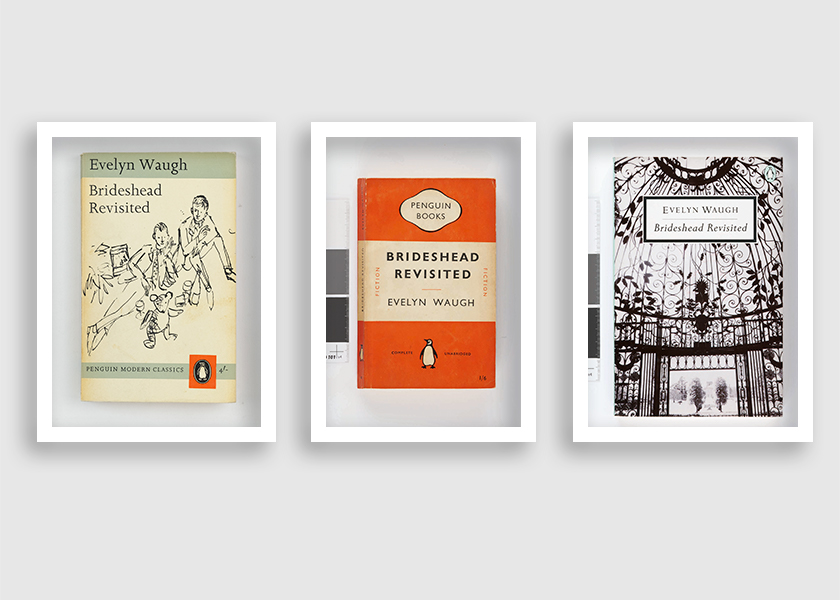
Over time, Evelyn Waugh's Brideshead Revisited has become its own kind of icon, inspiring a visual language of sprawling lawns, country estates, white tailoring and teddy bears. No wonder, then, it has inspired a raft of dreamy covers. As the book reaches its 75th anniversary, we share how the Penguin team have re-imagined Waugh's novel over the decades.
1951
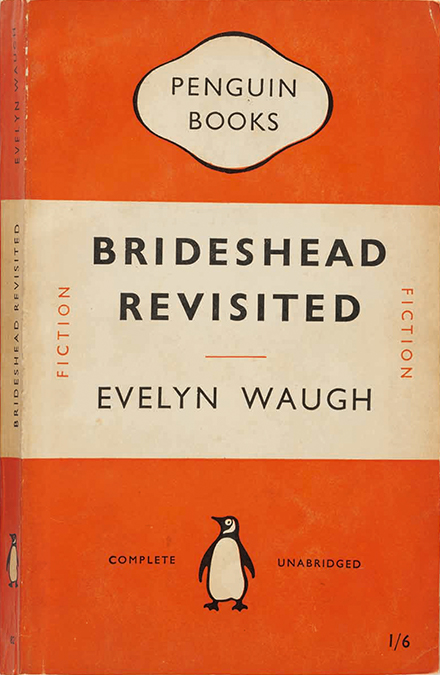
Brideshead Revisited was published in 1945, but received the 'tri-band' treatment in 1951. This was the orange design that has become synonymous with Penguin ever since, and was honed by Bauhaus typographer Jan Tschichold in 1948, a few years before Brideshead's publication with the company. Penguin founder Allen Lane brought Tschichold in to be the company's head of typography and production for three years in the late 40s. While his stint in the company was relatively brief, his insistence on consistency across all of Penguin's books has left a lasting legacy.
1962
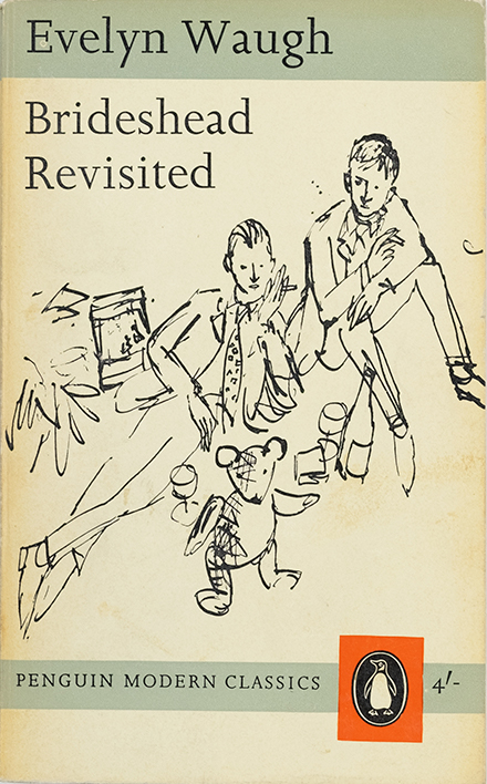
This elegant, minimalist cover – released as part of the Penguin Modern Classics series launched just a year prior, in 1961 – was drawn by illustrator Quentin Blake, whose work here might be familiar to anyone who grew up reading Roald Dahl’s classics. Many of their covers and inner illustrations, from Matilda to Charlie and the Chocolate Factory, flowed from his pen. Keen-eyed readers will notice that Lord Sebastian is depicted wearing Charles’s famous postage-stamped tie; his beloved teddy bear, Aloysius, is at his feet.
1970
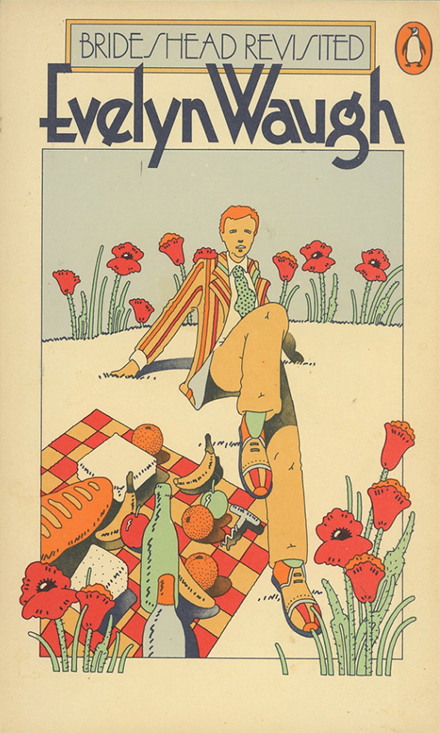
Printed in 1970 but used well into the 1980s, this elegant cover – attributed to illustration and design trio Peter Bentley, Michael Farrell and Stewart Burnett, though design heads suggest it’s primarily Bentley’s mind on display – finds the young Charles Ryder laid on his picnic blanket. Fun fact: Bentley would later be affiliated with The Beatles’ Apple Records, and in the early 1970s, as an assistant to John Lennon and Yoko Ono, drove the couple across America as they tried to kick drug use.
1989
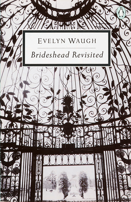
In 1989, Brideshead Revisited joined a number of books in being re-titled "Twentieth-Century Classics", and got a smart new cover to boot. The Penguin logo moved to the top right-hand corner in a pale blue oval – the only bit of colour on the monochrome cover. It would take another year before colour images would be introduced to the series. This elaborate ironwork dome conjures the grandeur of Brideshead, as well as its confines.
2009
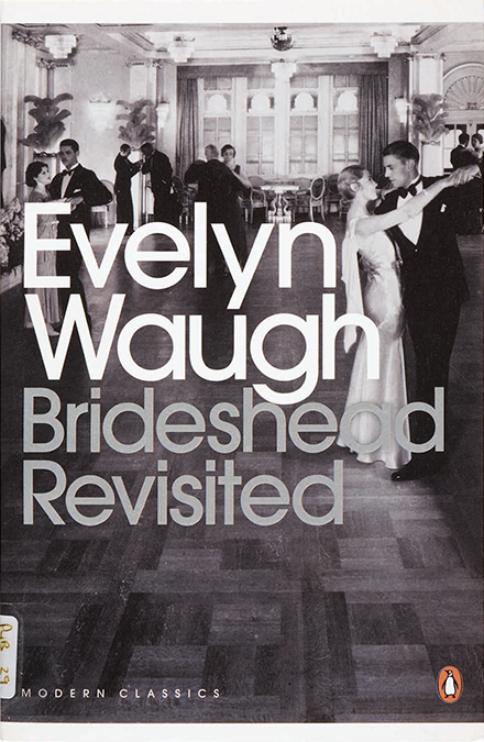
The classic took to the dancefloor at the end of the Noughties as part of art director Jim Stoddart's Penguin Modern Classics 2007 makeover. The photograph was taken on the steam liner Empress of Britain, in 1934, but the typeface is some 40 years older. Avant Garde was typographer Herb Lubalin's creation inspired by the logo of the provocative – and defunct – magazine of the same name.
2016
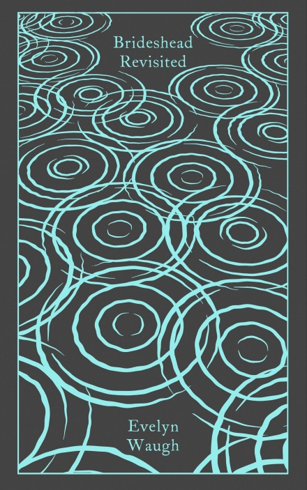
Released as part of the 2016 series of our famed Penguin Clothbound Classics collection, this hardback edition of Brideshead was designed by Coralie Bickford-Smith. As with all of her Clothbound Classics designs, the principal motif – here, pond ripples that evoke the passage of time – is foil-stamped into linen, and the book features a ribbon bookmark to keep your place.
2017
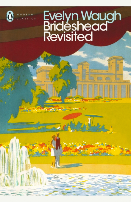
The most recent cover of Brideshead Revisited injects colour into the Avant Garde Penguin Modern Classics design thanks to a 1947 poster for the LMS railway by painter Ronald Lampitt, who later designed Ladybird book covers. It's the kind of hazy image that conjures a sense of endless afternoons. Or, as Sebastian puts it: “If it could only be like this always – always summer, always alone, the fruit always ripe and Aloysius in a good temper."