- Home |
- Search Results |
- Art directors share their all-time favourite book covers
Ah, the age-old trope: never judge a book by its cover. But as book lovers, that’s easier said than done. Great cover design can a make or break a new release, or cause you to fall head-over-heels with that Instagram-worthy new edition.
So what makes a great cover? Here we ask the experts: seasoned book designers themselves. From the understated and eye-catching to pop-culture masterpieces, these are their favourites.
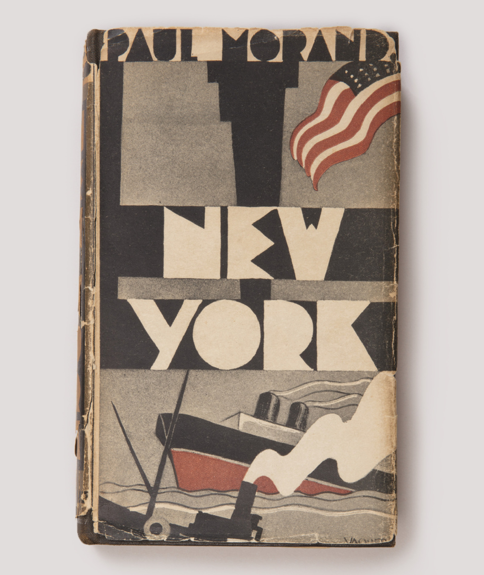
New York by Paul Morand, cover by Joaquin Vaquero Palacios
While it’s impossible to choose my all-time favourite book cover (which changes week on week), I have a recurring crush on this 1930 first edition of New York by Paul Morand, with dustjacket and illustrations by Joaquin Vaquero Palacios (1900-1998), a Spanish architect, painter and sculptor.
With just a few bold ingredients this cover emanates a confidence which perfectly encapsulates the 30s in New York, a period of self-belief, dynamism and glamour. Every time I look at the cover it inspires me in a different way. In fact, I leaned heavily on it when designing the (soberer) cover for Asia’s Reckoning a couple of years ago.
– Jim Stoddart, art director, Penguin Press
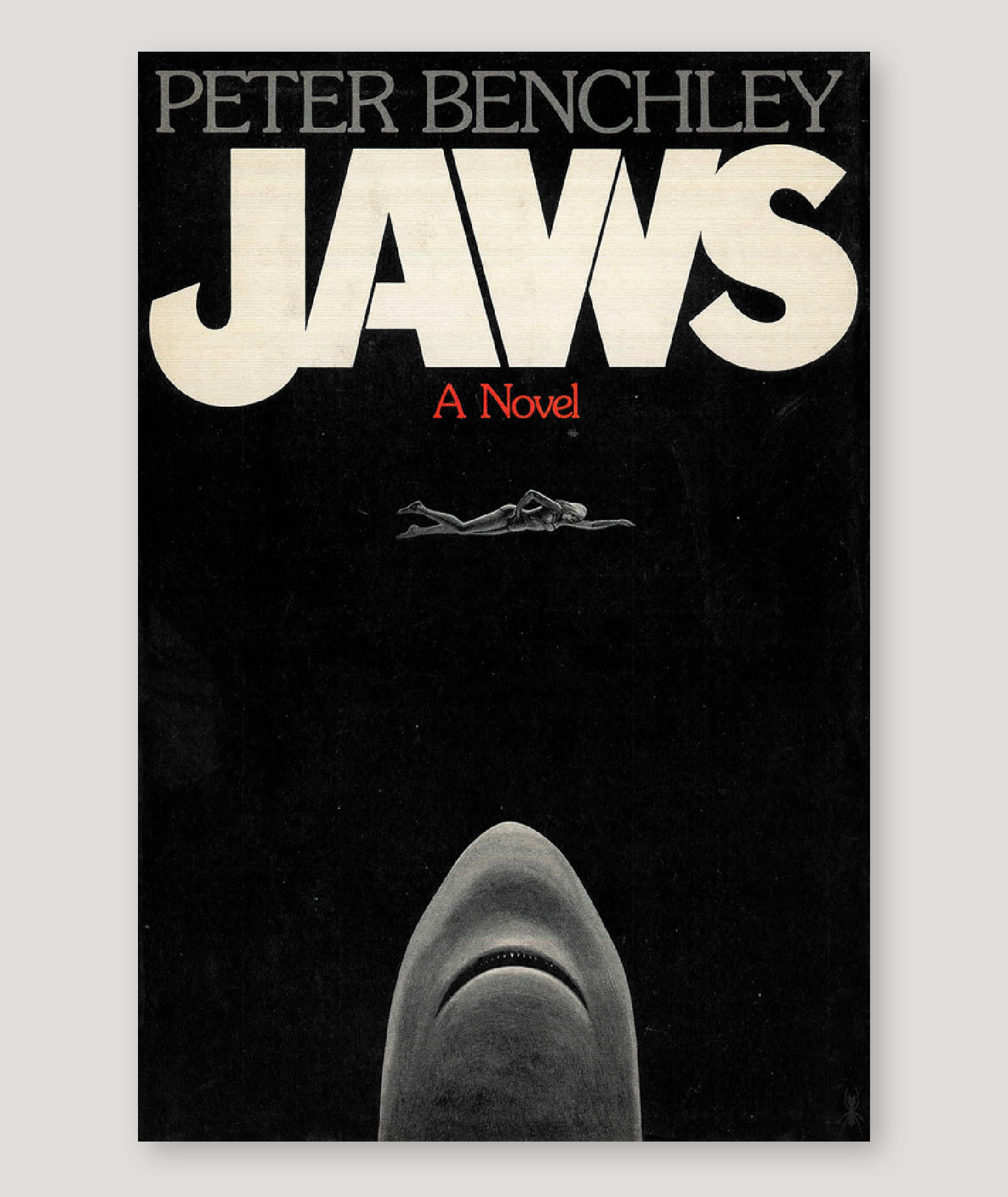
Jaws by Peter Benchley, cover by Paul Bacon
One cover I’ve always had a dark fascination with is the original hardback edition of Jaws. Designed by Paul Bacon in 1974, this cover was so iconic that it went on to inspire the Universal Studios movie poster.
I love the stark black palette and the abundance of space within the composition. For me, the shark seems more menacing here than in subsequent renderings, eerily reminiscent of H.R. Giger’s Chestburster from the film Alien.
It’s a very emotive cover. It fills me with a sense of foreboding and reminds me why I don’t like to swim too far out in the sea. At the same time, I feel a sense of warmth as I recall the many times my brother and I would watch the film whilst growing up.
– Jason Smith, art director, Cornerstone
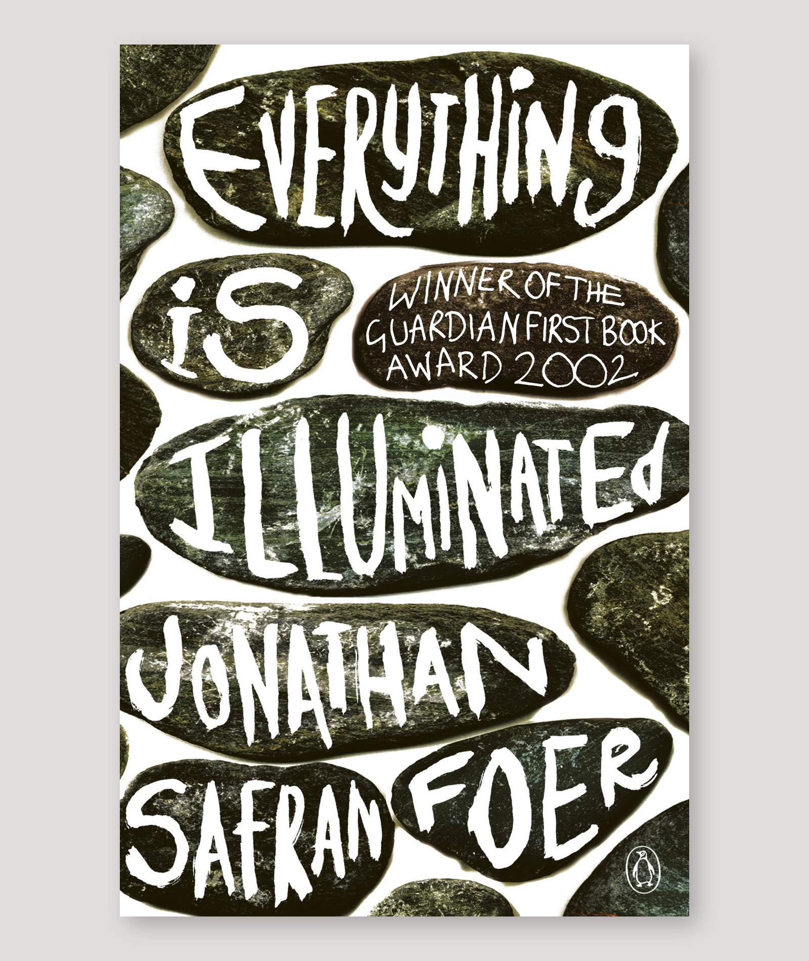
Everything is Illuminated by Jonathan Safran Foer, cover by Jon Gray
There have been many smart and beautiful covers I have admired over the years, including David Pearson’s brilliant cover for 1984, Jonny Pelham’s beautiful jacket for Jonathan Franzen’s Purity, Jamie Keenan’s recent design for Metamorphosis by Kafka, or indeed David Pelham’s cover for A Clockwork Orange. But none has resonated and remained with me like Everything is Illuminated by Jonathan Safran Foer, designed by Jon Gray.
The messy but uniquely appealing hand-written text in scratchy lozenges has a smartness and richness which belies its limited colour palette, and seeming lack of narrative. I believe that his handmade, hand-drawn cover began a trend which still persists, but what’s so remarkable about Gray’s cover is the verve and freshness it still holds, seventeen years after its publication.
– Richard Ogle, art director, Transworld
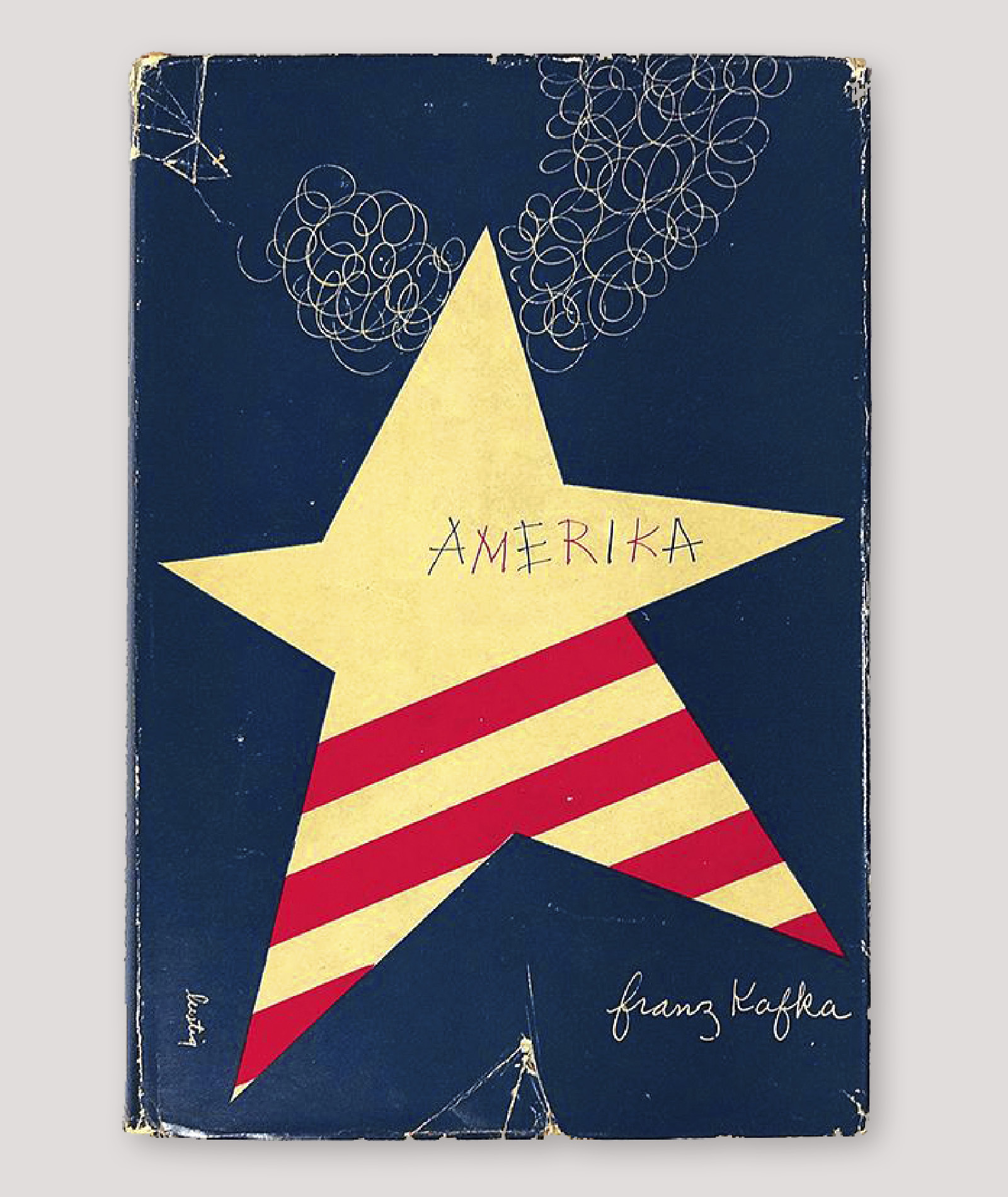
Amerika by Franz Kafka, cover by Alvin Lustig
Amerika by Franz Kafka was designed by Alvin Lustig for New Directions Books in 1946. Lustig was a renowned twentieth-century graphic designer and a design hero of mine. I am in awe of all of his book covers, and it is hard to single out one cover but, for me, this iconic design stands the test of time. I have read that his method was ‘to read a text and get the feel of the author’s creative drive, then to restate it in his own graphic terms’. Amerika is so fresh, playful and modern that is could have been designed today.
– Suzanne Dean, creative director, Vintage
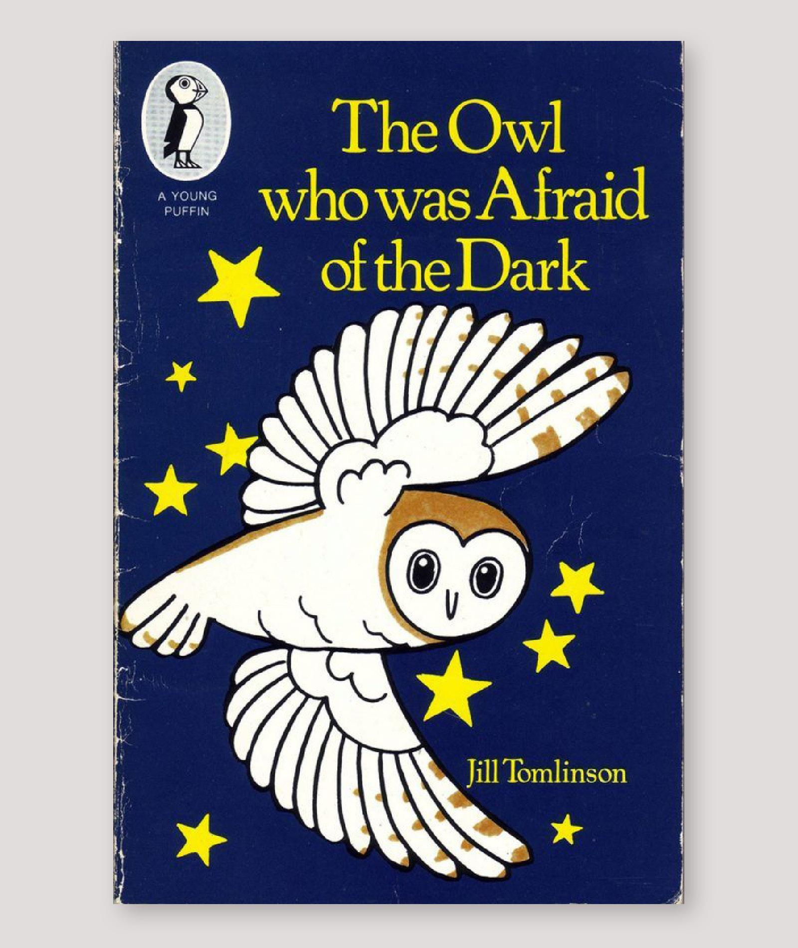
The Owl Who Was Afraid of the Dark by Jill Tomlinson, cover by Joanne Cole.
This cover is my childhood. I had the book at home, which I treasured, and my family also had the audio cassette in the car. It was read by Maureen Lipman and would be the first story played on any long journey.
While it’s not the best design, the art is so clear and the night sky background so rich, it makes the dark feel welcoming – not scary. I love that Plop the owl fills the cover with his wingspan and stares at the reader with the same curious naivety that is described in the story.
I visualised the entire story in Joanne Cole’s style when listening in my parent’s old Ford Cortina, and still do today.
– Ben Hughes, deputy art director, Puffin