- Home
- About
- Company articles
- How Neil Gower designed nearly every Bill Bryson book
How Neil Gower designed nearly every Bill Bryson book
Graphic artist Neil Gower was a guest judge for the Adult Non-Fiction category at the 2020 Student Design Awards. Having worked on designing the whole of Bill Bryson's backlist, Neil knows the relationship between the text and the visuals inside out. We spoke to him about how he created covers for nearly every Bill Bryson book.
My favourite place to work is...
I have a lovely, airy loft studio in our house on the edge of Lewes in Sussex. Painted a pale yellow, it is my ivory tower with a great view of the South Downs and Ouse Valley.
I see inspiration in...
It’s more trifling things that really thrill me and feed into my work. My pulse can be quickened by a shapely espresso cup, or an elegant shirt. One of the most visually striking things I’ve seen lately was a website devoted to Argentine bus-tickets: the combinations of colour and type on the cheapest paper were breathtaking. I also have a sizeable collection of old atlases, maps and guide-books, which never fail to get the creative juices flowing.

Working on new cover designs for Bill Bryson’s books crept up on me, in a way...
In 2013, having previously produced various maps, endpapers and illustrations used inside his books, I was asked to design the cover for a new title, One Summer. The brief: to capture the spirit of 1927, the momentous year in American history that it celebrates. The process was rather exciting, the design evolving as I received one chapter at a time, hot from Bill’s computer, ink still wet. The cover was very well received generally but also, crucially, by Bill himself. When he came to write The Road to Little Dribbling, he requested that I devise the cover for that too.


I found inspiration in famous American artists to craft the style of the covers...
I was floundering somewhat for an idea for The Lost Continent when Edward Hopper’s Gas painting sprang to mind. It offered the perfect cocktail of driving and a vanishing America; the last chance to fill up before a momentous journey. In my version, I decided to give that lonely, dapper attendant a customer. It was an extension of my commandeering of the Jolly Fisherman as a piece of quintessentially British culture; here was our Melancholic Pump-Attendant, symbol of America’s past.
The other design that ‘borrows’ a slice of US culture is Made In America, based on Saul Steinberg’s celebrated New Yorker cover. This idea lent itself particularly well to this book, allowing me plenty of scope for scattering textual references across the country (some of them very subtle for those prepared to look hard) and providing a US-centric view without being sniffily anti-American.
All my designs go through the same stages...
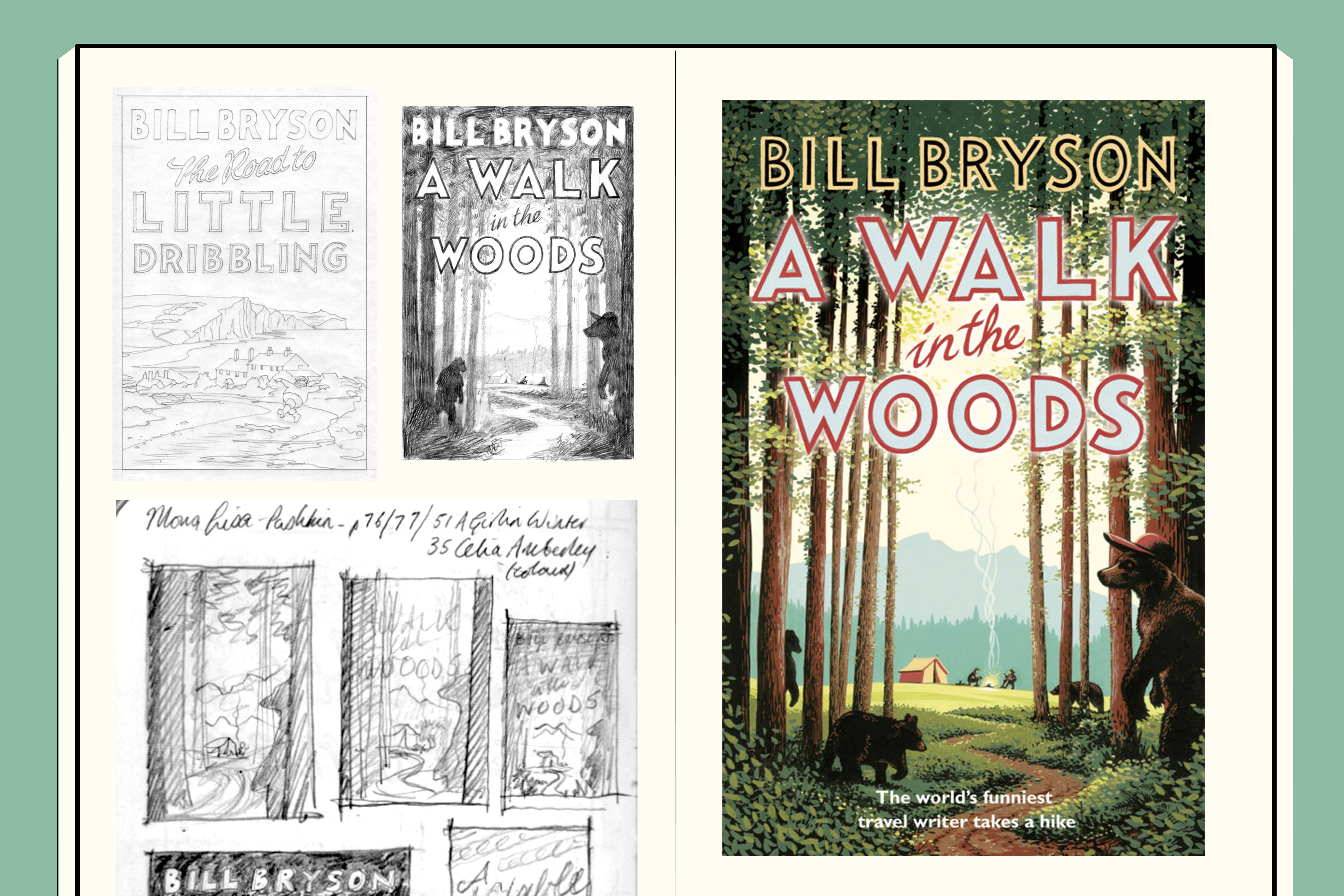
The first of which is panicky reading and note-taking, convinced that no ideas will come; that this will be the book that finally exposes me as a fraud. The notes give way to scribbled thumbnail sketches, the visual equivalent of thinking out loud.
Ultimately these develop into more refined, full-size pencil sketches and colour samples, which go off to Bill for approval, and then through the Transworld cover meeting. At this stage, a careful balance must be struck between giving a clear idea of one’s intentions while still holding something back to provide (one hopes) that ‘wow’ moment on presenting the final art.


Creating a consistent look for the backlist was a great challenge...
In this instance, the author and most of the titles are well known, a built-in level of awareness that gives a head-start in catching a reader’s attention. The most practical difficulty posed by the titles themselves is the variation in length. The pithy title At Home and the expansive The Life and Times of the Thunderbolt Kid both have to sit comfortably within the same space.
Other than noting this potential pitfall, I tend to ignore the title and simply respond to the text. It’s very gratifying how, through doing this, connections between title and image create themselves – the chalky track on The Road to Little Dribbling, for example; the odd juxtaposition of Northern Lights over Istanbul on Neither Here Nor There; the way The Lost Continent is hinted at beyond the dark trees on that cover. The connections are not always obvious, are often just subliminal, but are unmistakeably there.
I know just the right materials I need to create my covers...
The covers are painted entirely in gouache (for the record, Winsor & Newton if there’s a year’s free supply on offer). They provided just the right feel for One Summer and The Road to Little Dribbling – a period poster feel for the former; fresh, flat colours for the latter. Much of Bill’s writing is affectionately nostalgic, and gouache, deployed in carefully gauged palettes, nods to this without being too backward looking. It also has a freshness in print, a vividness that I hope complements Bryson’s writing. He can make familiar words fizz with new life on the page and I try to achieve something similar with imagery.
The author himself on how important cover design is...
I think a good cover design is vitally important to the success, or not, of a book. Generally, in my experience, authors aren't encouraged to be closely involved in the cover design , so we are fairly peripheral to the conceptual part of the undertaking, but luckily I have mostly had brilliant artists like my old friend David Cook or the peerless Neil Gower designing my covers, so I have almost never been disappointed. As a purchaser of books, I can't tell you the number of times I have bought a book simply because the cover made it look wonderful.