- Home |
- Search Results |
- How to generate creative ideas, with VINTAGE Creative Director Suzanne Dean
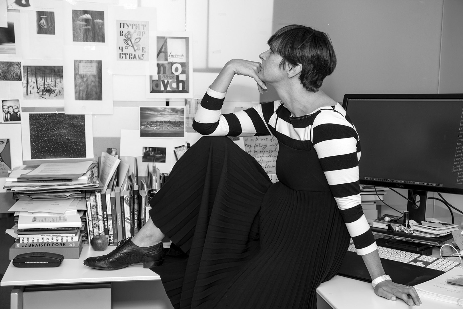
Suzanne Dean is the Creative Director at VINTAGE. As well as collaborating and art directing with her team of designers, she can be creating between 20-30 covers at one time. So how can you generate that many ideas? Here she shares where she finds inspiration, why being outside of an office is so important, and why you should always carry a notebook.
At the very start of the creative process…
We receive new briefs and manuscripts on a monthly basis. I always read all of the manuscript – you really need to know the book, I don't like to think that I'm missing anything. After that comes the key part, research. If the book is a classic title I'll start by looking at any of the previous covers, as I don’t want to repeat anything someone has done before me. I make notes in the margins of the novel, and from there I go to my creative notes.
Looking for inspiration online has its pros and cons…
The more obvious thing is to use the internet in the ideas process, and I think the internet is a great way to start sourcing things. The problem can be that everyone looks at the same thing – you can see the similar points of interest that have sparked things. I would suggest to anyone that it's really important to get a wide range of interests, as then you're not seeing the same range of things as everyone else; it's a different starting point and that brings something new to the whole mix.
Go outside and take in the world around you…
I think it's vitally important to be outside to bring that back in. My team take turns to come up with ideas for trips out – we go and see exhibitions, student shows, or go to visit museums and art galleries. Very recently we went on a tour around the London Library which was fascinating. Input equals output so make sure you’re going out to see things. A designer will always be collecting and recording – carry a notebook around, or make folders of pictures you’ve taken on your phone. Feed your creative soul and ideas will come.
Playing will help you find your best ideas…
The worst thing for a designer is to be sitting and looking at a blank page. How to start can be terrifying but you mustn't be scared of failure. I always start by sketching and doodling – exploration and play are essential to creating ideas. Try and fill pages to get past the more obvious ideas, if you bring energy and excitement to it you will get there – keep pushing.
Mood boards can quickly pull together a visual route…
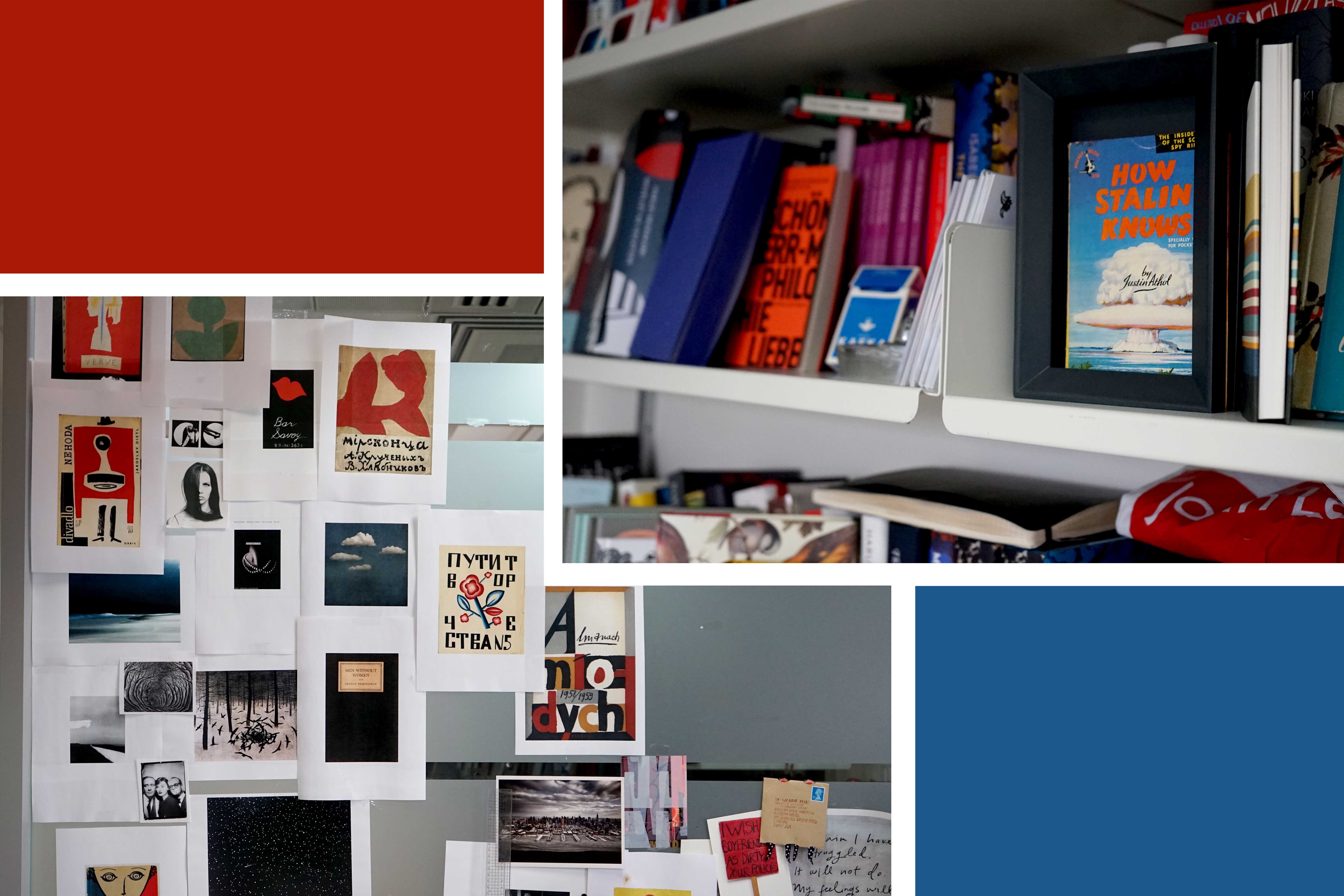
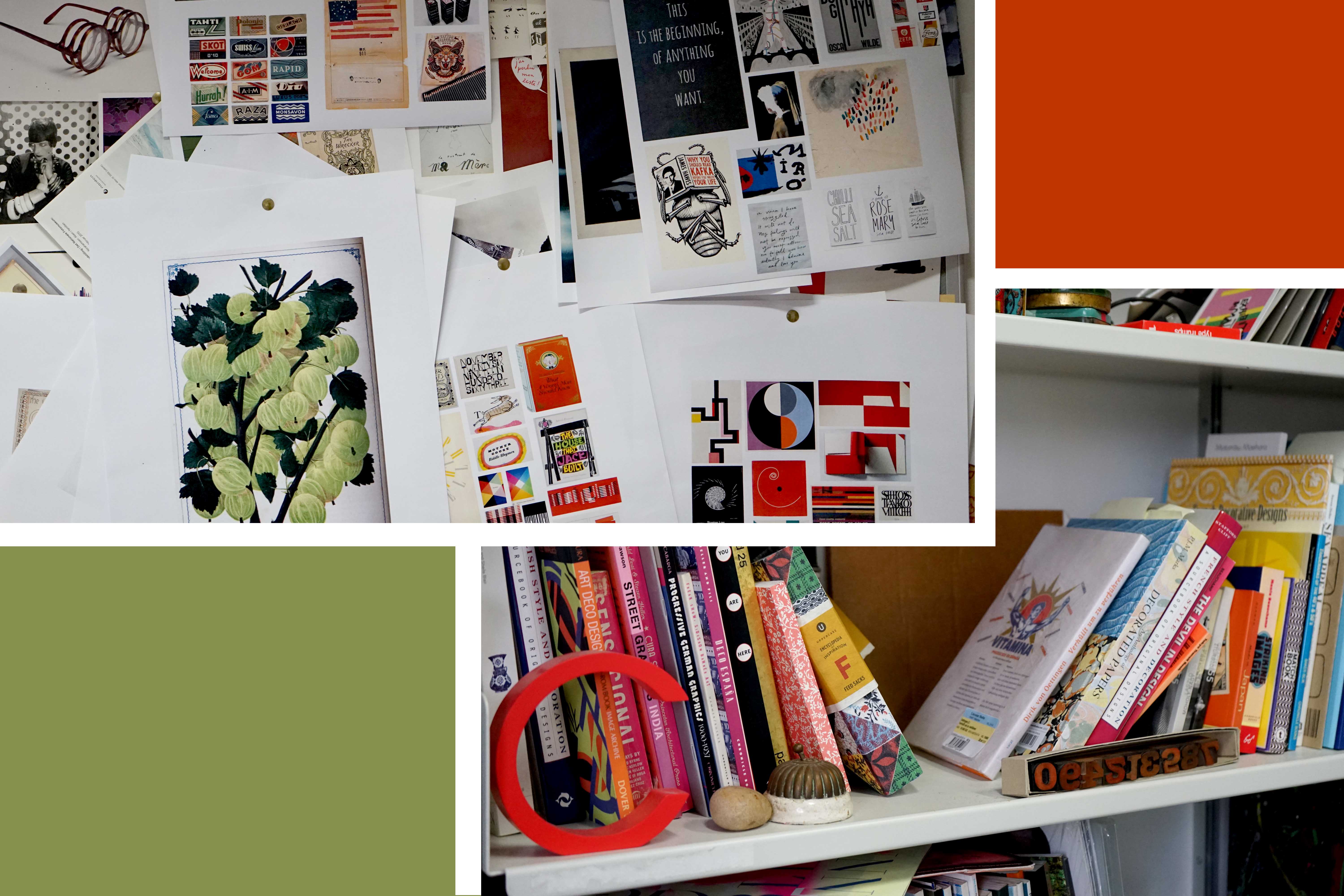
My initial series of mood boards could include something I've doodled, something I've seen, or something that sparks an interest that is connected with the novel. Bringing all of these things together will help me look for colour, atmosphere, tone and a sense of place. Very often when you come into my office, you'll see my walls are covered in bits and pieces for various jobs that I'm working on.
As a designer, seeing these different sparks of inspiration really energises me and helps me find a direction in which to move forward. On a practical level, when you have a collection of images, it’s very easy to communicate to an editor the direction in which you want to take the cover.
Reel it back…
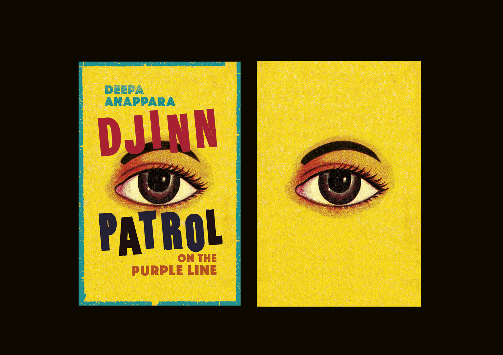
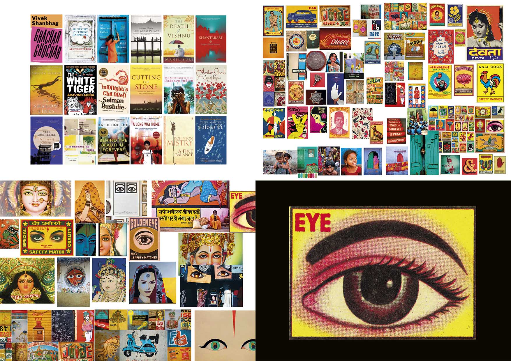
For the cover of Djinn Patrol on the Purple Line by Deepa Anappara, I read the manuscript and then researched all the other books set in India. You can see the mix of colours, and how they seem to divide into something that’s either graphic or narrative based. My first mood board was based on graphics. I was looking for colours, tone and aesthetics. I saw that eyes proved to be a recurring theme, so then I did another mood board purely focused on eyes.
A lot of these are from matchbox illustrations, which are skilfully produced but slightly naïve, and have an irresistible charm. The eye seemed like the perfect hybrid of visual culture on India – a quirkiness, its history and humour. It also reflected the detective element within the story, so it felt perfect.
Keep playing…
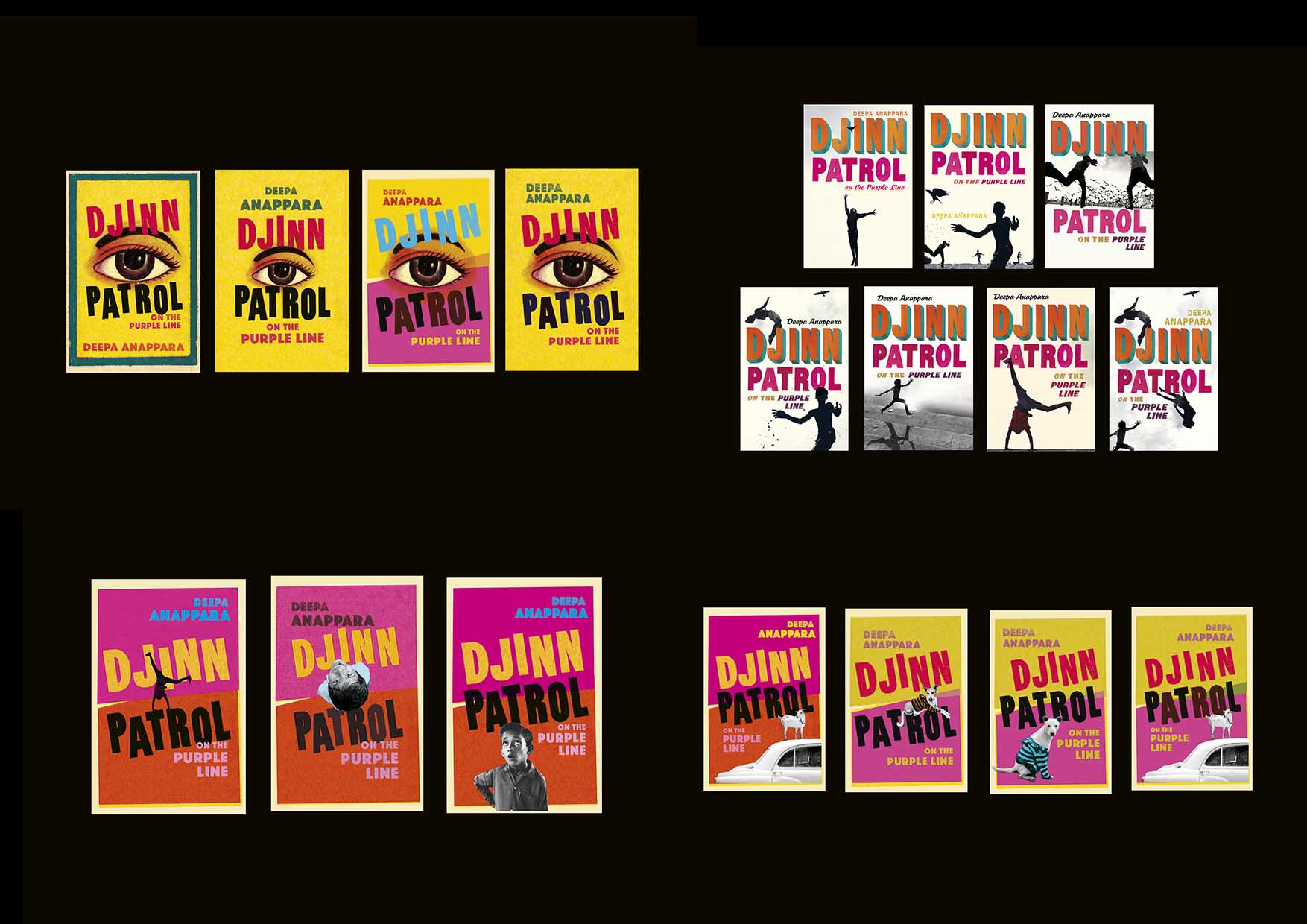
I worked up a series of visuals pushing the type and the colours, but you can see an overall consistency to the look and feel.
Although I loved this, I can't use just one option to give the editors. I found the photographer Dimpy Bhalotia on Instagram and approached her to see if I could play with her images. I loved the figures, which are silhouettes but convey so much character. I came up with a series of covers using these silhouettes, as well as creating another two photographic routes concentrating more on reflecting the narrative of the story.
Pushing your ideas helps cement the final concept…
Eventually we came back to the cover with the eye; which had been my gut feeling, but I'd pushed my ideas process and definitely knew it was the one. It’s so bold you can't miss it – you could see that cover halfway across a bookshop. Everyone in the covers meeting said it had to be the eye, and so it became the final cover.
