- Home |
- Search Results |
- “Real horrorshow”: the iconic covers of A Clockwork Orange through the decades
A Clockwork Orange is famous for the same reasons that its author, Anthony Burgess, came to loathe it.
Set in a dystopic near-future in which violent gangs of teenagers – such as that of 15-year-old narrator Alex, who speaks in a Russian-influenced slang in which “droog” means “friend” and “horrorshow” means “good” – rule the streets, the novel interrogated the ugliness of human impulse and the complicated morality of the state withdrawing our freedoms to act upon it. It was released in 1962 to divisive reception, but it wasn’t until 1971, when the novel was adapted for the cinema by Stanley Kubrick, that it became a cultural phenomenon.
Burgess was incensed. In 1985, he’d call his novel “the raw material for a film which seemed to glorify sex and violence,” one which he claimed “made it easy for readers of the book to misunderstand what it was about, and the misunderstanding will pursue me till I die”.
Even if the film brought the novel to many new readers, it is the original work's evergreen themes, innovative use of language and unforgettable scenes that have ensured its 'classic' status. And its gorgeous, boundary-pushing book covers haven’t hurt, either. Below, we take a look at some of A Clockwork Orange's most iconic designs through the decades.
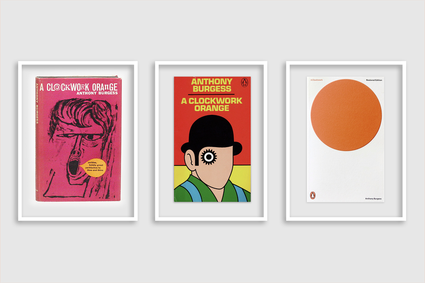
1962
The first edition of A Clockwork Orange was published by William Heinemann Ltd. in 1962. The cover, designed by Barry Trengove, featured a brutish, open-mouthed portrayal of young Alex – the first of many to come. It was eight years before a second printing was required in 1970, a year before Stanley Kubrick debuted his film adaptation. The book’s reputation was about to change.
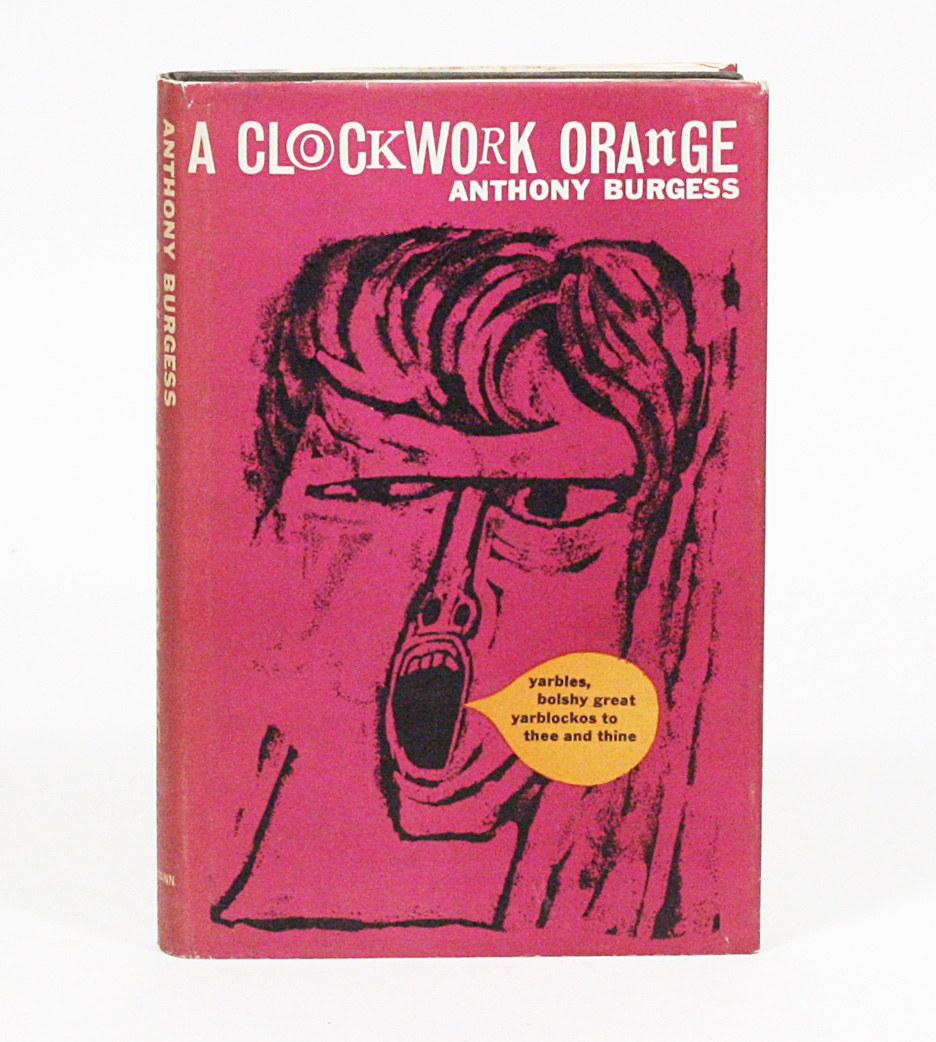
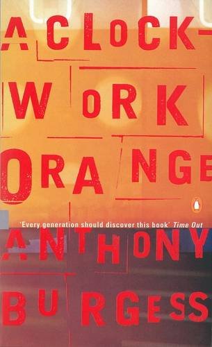
1972
The first Penguin UK publication of the novel ushered in one of the most famous book covers of all time, featuring what is now commonly referred to as the ‘cog-eyed droog’. The inclusion of the teaser “A TERRIFYING NOVEL… NOW A TERRIFYING FILM” on the book’s cover is all that signifies the paperback’s movie tie-in, which was Kubrick’s doing: when the film’s director legally forbade Penguin from using the design elements of Philip Castle’s film poster, David Pelham was tasked with commissioning an illustration.
And when the original illustrator submitted a design that was not only poorly done but extremely late, Pelham was forced to take matters into his own hands. Having seen the film, he designed a cover that borrowed Alex’s famous bowler hat and turned his mascara-lashed eye into a cog, playing up the ‘clockwork’ theme of free will.
It would become one of the most iconic book covers of all time, with variations in both 1973, when the “terrifying film” tagline was removed, and in 1993, when the typography was updated. Pelham’s cover remained in publication for 25 years.
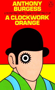
1996
The ‘droog’ was finally retired in 1996, when Penguin republished A Clockwork Orange as a Penguin Twentieth-Century Classic with an introduction by Blake Morrison, in which he quotes Burgess famously dismissing his own novel as “too didactic to be artistic”. It’s in this essay that Burgess’s disdain for his character’s violence is most clearly articulated.
The cover photography is by Lionel F. Williams and SOA / Photonica, an homage both to Pelham’s cover (via the cogs) and Kubrick’s filmic depiction of Alex undergoing aversion therapy to cure his violent ways.
1998
In 1998, Burgess’s now cult-classic novel became a ‘Penguin Essential’, its cover updated to convey the unsettlingly anonymous aesthetic of a cut-and-paste ransom note. The typography is overlaid on a vivid orange photo by designer Dirk Van Dooren that conveys a doomy, disorienting sense of impending dusk.
2000
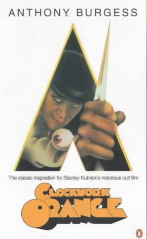
With the release of Stanley’s Kubrick’s A Clockwork Orange film on DVD, Penguin UK republished Burgess’s novel with the original Philip Castle-designed film poster for the first time in almost 30 years.
2000
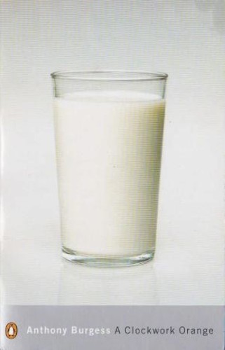
That same year, A Clockwork Orange was made a Penguin Modern Classic and reissued with a millennial band of silver and cover photography by Véronique Rolland of a glass of milk – ostensibly from the novel’s sinister Korova Milk Bar. It was a simple but effective design; despite slight redesigns in 2005 and 2008, this Modern Classic version is still in print 20 years on.
2008
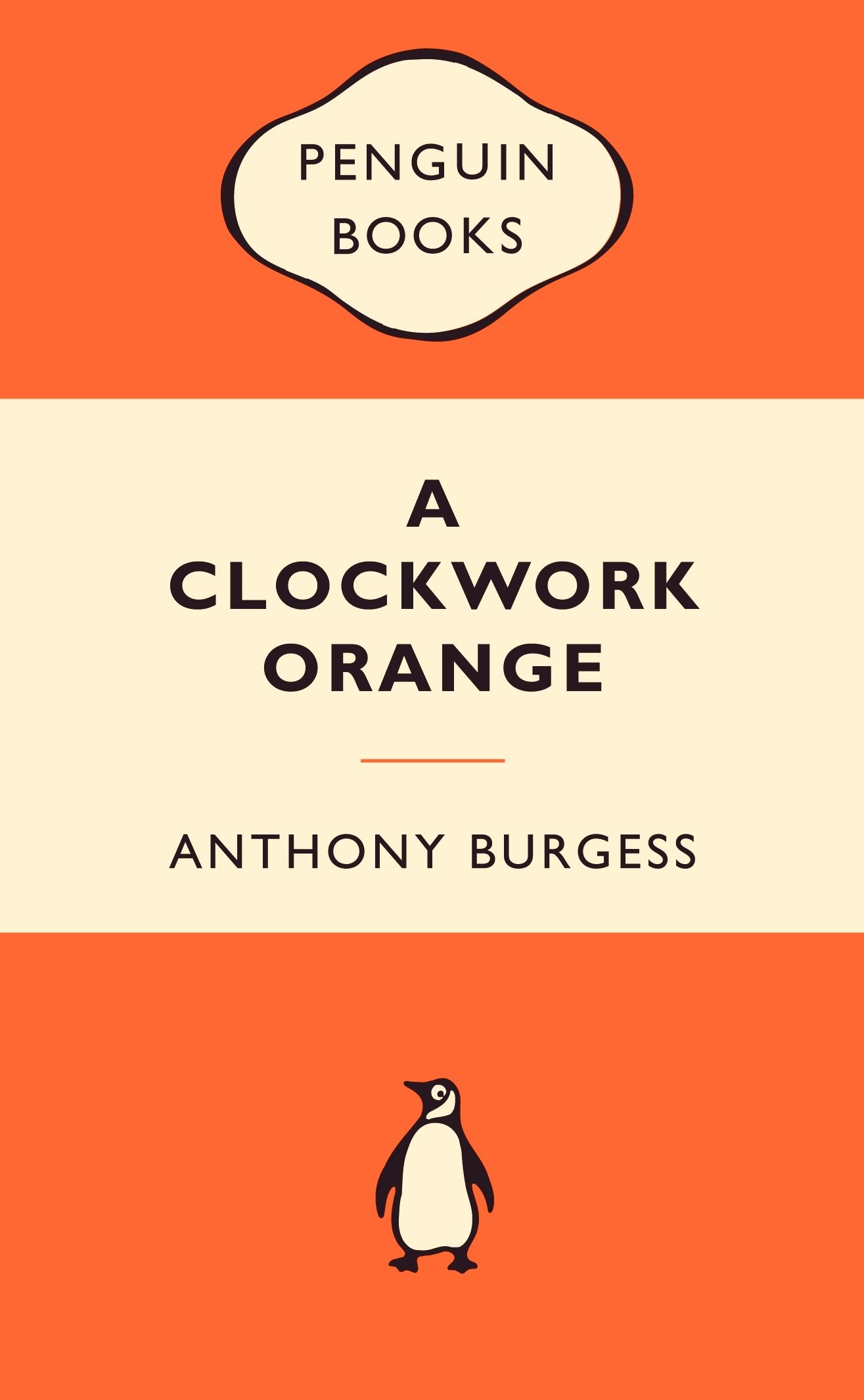
In the opposite order of most Penguin classics, which started as ‘tribands’ in the 30s, 40s and 50s, A Clockwork Orange didn’t get the triband treatment until 2008. Originally designed by Edward Young in 1935 and refined typographically by Jan Tschichold in 1948, the triband design suits the novel picture – just look at the colour.
2010
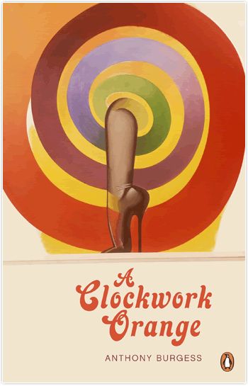
The last decade has been marked by a series of new departures for the cover’s design. This 2010 ‘Penguin Decades’ iteration harkens back to the 60s with its slightly psychedelic design, but pivots away from the cog-eyed droog to evoke the more dangerously sexual inclinations of the novel’s characters.
2011
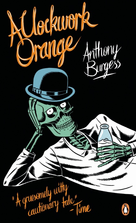
This cartoonish cover, for a 2011 publication of Burgess’s novel, features an illustration in which young Alex is portrayed symbolically as ‘already dead’, but retains the famous droog’s bowler hat and milk.
2012
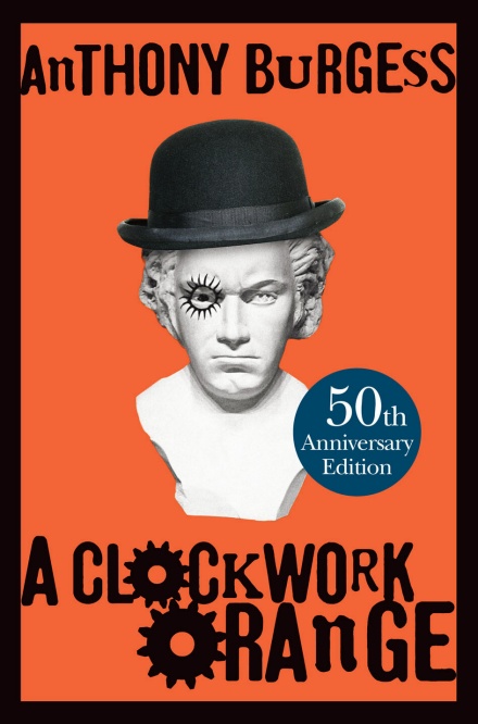
In 2012, the 50th Anniversary edition of the novel was published in hardback once again by William Heinemann, with a restored version of the text (including a once-omitted final chapter) as well as “interviews, articles, reviews and other previously unpublished material” – not to mention a foreword from Martin Amis. Its cover features a series of throwback design elements, including a bust of Beethoven, Alex’s favourite composer, and cogs in the title typography.
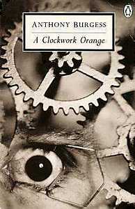
2013
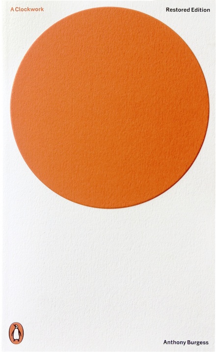
The latest, and perhaps most elegant iteration of the novel also features its most abstract cover: a radically simple orange circle on a white background, designed by Jonathan Barnbrook. And things have come full-circle, too: in an interview, even Barnbrook had to admit that he was “very aware of [Pelham’s cover], and I think every design ever since has been in relation to that.”
Which cover is your favourite? Let us know at editor@penguinrandomhouse.co.uk for a chance to appear in our reader’s letter page.