- Home |
- Search Results |
- The making of a modern ‘spell-book’
It took a while, working through other thoughts and ideas, before we reached this point. But how to illustrate an absence from language? That was the problem. And finding the solution was where the work lay.
Sometimes it seemed obvious. Sometimes it took a week of walking and worrying away at a problem to find an answer. And I think that the words and images each informed the other.
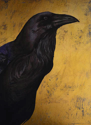
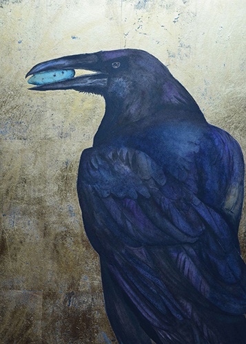
Now and again, if I moved ahead, I would have to redraft. I thought one day, when I was stuck on a problem, that I would just paint the raven idol. After all, what could Robert write that would make me paint it any differently?
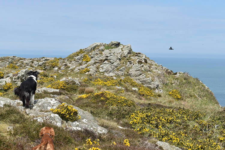
Then his raven flew into my inbox, and from that moment I could only work on the raven, redrafting my images. I wrote out the words, and they flew in my dreams. I’d just picked up my puppy, Pi. We walked up the hill to watch the ravens fly and she ran away and off and over the hill, and when I called her she came back, with a raven feather in her mouth. A gift from the wild. The perfect answer to the unvoiced question I was asking the ravens. Wild magic.
When you first started thinking about the cover, did you already have a picture in your mind? What aspects of the book did you want to highlight?
JM: I had no idea what to do for the cover, but the plan was that the design team would put one together in-house. This wasn’t the way I usually worked; I’d just spent two years immersed in the book, so it felt a bit strange.
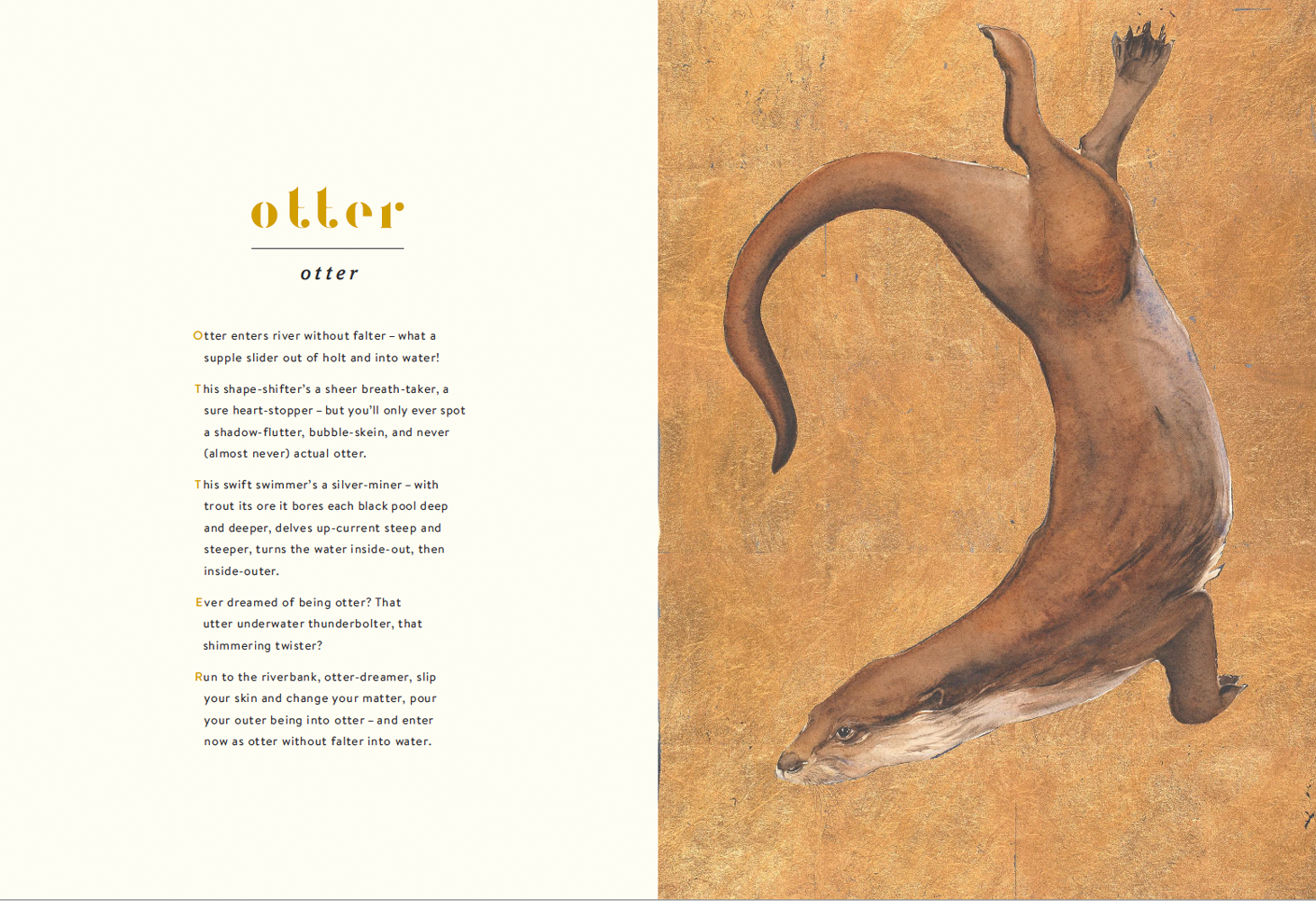
I hoped the cover would really reflect the poetic nature of the book; inside, the absence spreads are my attempt to paint a spell, a poem, to echo Rob’s words - a pre-echo.
The first draft cover I was shown featured a mountain hare in a field of dandelions. It didn’t, to me, quite sit with the magic and mystery of the book, which is, I hope, a hymn of praise to the wild around us. Some other options took cues from children’s books or encyclopedias, but this book isn’t that. It’s a book for all ages.
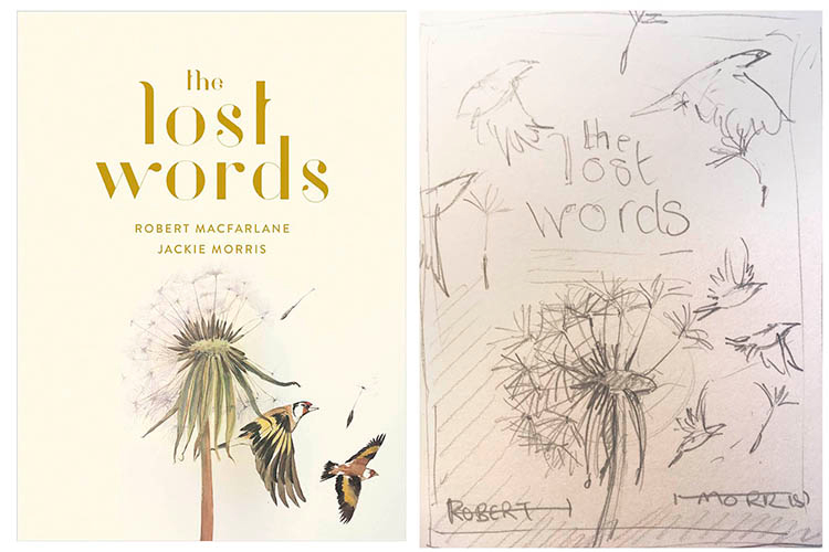
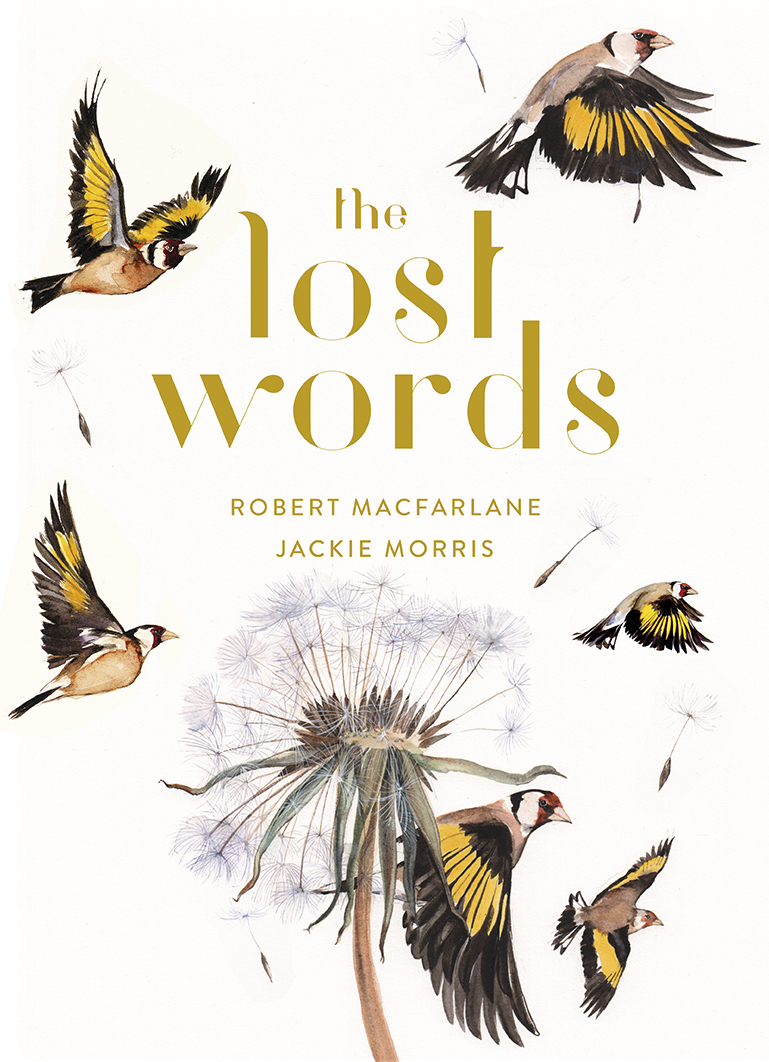
When Robert asked me what I thought, I answered with a drawing of a dandelion head, seeds blown away, and a goldfinch in flight. Sparse, time running out, but seeds bringing hope... more of a poem, I hoped.
But the book is large. It will take up space on shelves in shops. When the design team put my painting together with the type, I realised it needed to be much bigger, so I did another sketch - more finches, seeds blowing. I hope it will sit, quietly calling - rather than shouting - LOOK AT ME!
Can you tell us about the technical process of creating the cover?
JM: It went like this: first a small sketch, then a wander into the fields to find dandelions. Years of lying down in the long grass, looking, playing with dandelion clocks (I knew that research would come in handy eventually). There’s a great deal of pressure when it comes to doing cover art, but really I just tried to properly look at a dandelion. That’s all this kind of painting is, really. Looking. Paying attention. Looking again and trying to see how something is – how it really is, and not what you think it looks like.
Do you have a favourite element in the finished design - something that feels extra special or important to you?
JM: I do rather love the type. And the space. There’s gold foil, and I’m hoping the texture and the weight of the book feels good in the hands. I love the size of it.
You can judge a book by its cover. It takes teamwork to produce something beautiful. In the case of The Lost Words, there’s a wonderful team of people behind Robert and me.
Robert, you wrote the words of the book - how were you involved in designing the cover?
RM: I was lucky to be very involved, which speaks of the generous readiness of the design team to work with both author and artist to get the look right.
I knew I wanted goldfinches on the cover - a charm of them. Gold is this book's main colour: Jackie has used gold-leaf throughout to give a magical sheen to her images - they have shades of medieval illuminated manuscripts, or of Russian icons. So it seemed right to have goldfinches - goldies, as they're affectionately known - shimmering across the front of the book.
How does the cover design relate to what you both set out to do in creating the book?
RM: We want this book to conjure back the common words and species that are steadily disappearing from everyday life - and especially from children’s stories and dreams.
In a Cambridge University study, conservationists found British primary schoolchildren 'substantially better' at identifying Pokémon characters than species of common British wildlife. For weasel, read Weedle; for peewit, read Pikachu.
So, as the virtual world has moved decisively to the centre of childhood experience, our 'spell-book' is an attempt to enchant nearby nature again, much as Cicely Mary Barker's Flower Fairies taught generations of children the names and habits of our plants and flowers.
Children’s experiences are at the centre of the idea, then, but this looks quite different to a lot of children’s books - can you tell us a bit about why you wanted it to have a different style?
RM: Jackie and I have always thought of The Lost Words not as a children's book but as ‘a book for all ages’ - or perhaps a book for children aged 3 to 100. We wanted it to be quite unlike any other book that exists: to catch at the beauty and wonder - but also the eeriness and otherness - of the natural world.
So the cover needed somehow to speak of this strangeness, too, rather than trying to mimic an existing style. That’s how we came to this final design: ghostly in the windspun seeds of the dandelion head, lush in the charm of goldfinches that flit across it.