- Home |
- Search Results |
- A history of Penguin in objects
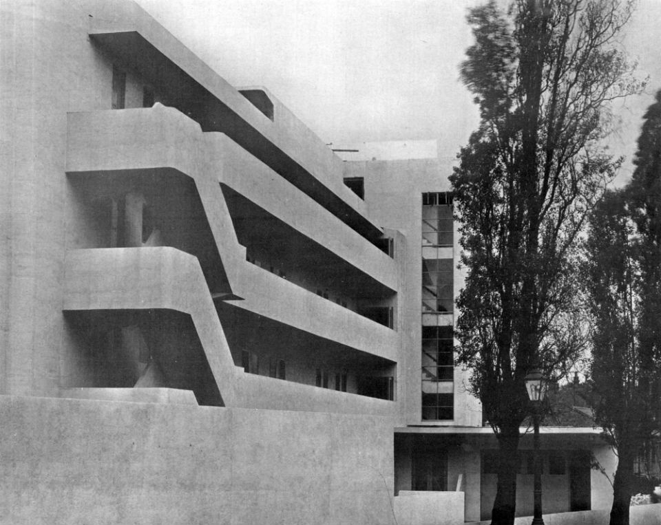
Tucked away on an unassuming residential street in North London is one of the most iconic and interesting residential buildings in the UK. Opened in 1934, the Isokon Building was the centre of a radical community of artists, designers, authors and intellectuals in the 1930s. It fell into disrepair between the 70s and 90s, but the building has since been fully restored with a gallery.
A new exhibition looks at the history of Penguin books, from the early cover designs to the story of how the logo came about: founder Allen Lane sent a young designer to Berthold Lubetkin's Penguin Pool at London Zoo to sketch what was to become the most recognisable logo in publishing.
Here are four objects from the exhibition that have helped shape the design of the new Pocket Penguins.
1. A bookshelf designed specifically for Penguin books
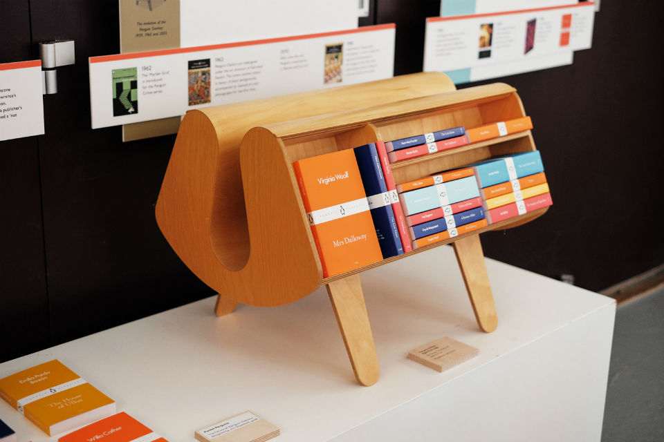
Here we have the Isokon Penguin Donkey. Not a hybrid mythical creature - but a shelving unit designed specifically to home your personal collection of Penguins. It was the meeting of minds between Isokon residents Jack Pritchard, Walter Gropius and Egon Riss that resulted in this piece of furniture and it's obsessed collectors ever since.
Originally produced in 1939 and then promptly discontinued, the little shelving unit was designed for Allen Lane’s new, affordable Penguin paperbacks. Today, nearly 80 years later, with the launch of the Pocket Penguins and a striking return to colour after decades of black, it's still the most natural home for a set of Penguins.
2. The first ever Penguin Classic
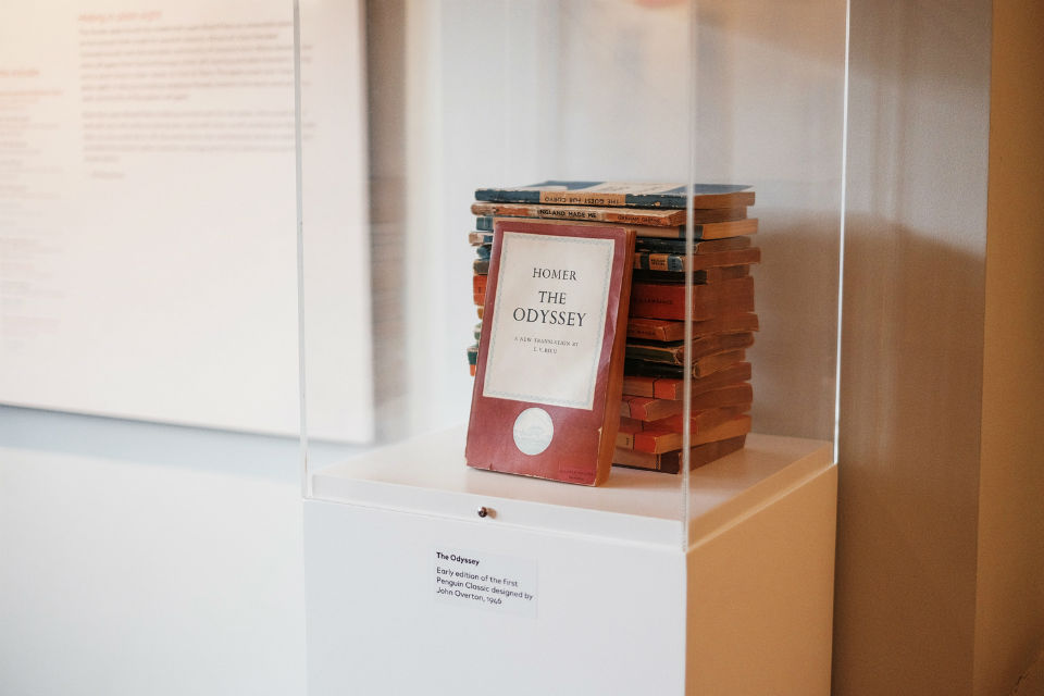
The first Penguin Classic published 70 years ago was a new translation of Homer’s The Odyssey. Translated by E. V. Rieu, it was the result of a gamble by Penguin founder Allen Lane that there was an audience for quality classics out there. The gamble worked and making great books available for all is still the ethos that drives Penguin Classics today.
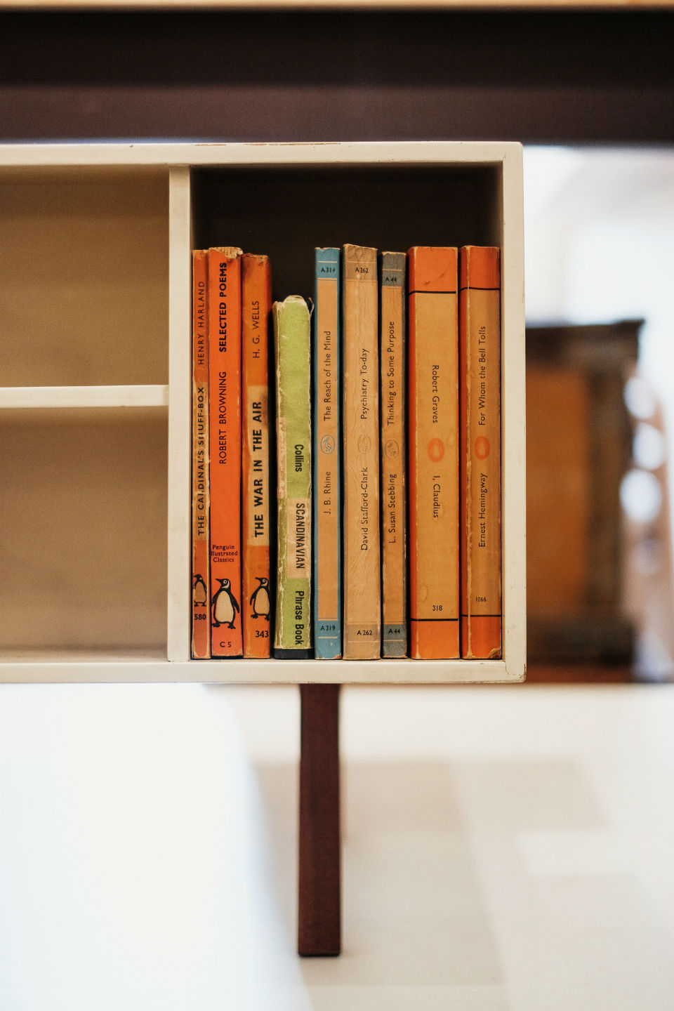
Here, a first edition of this title is displayed alongside other early Penguin books.
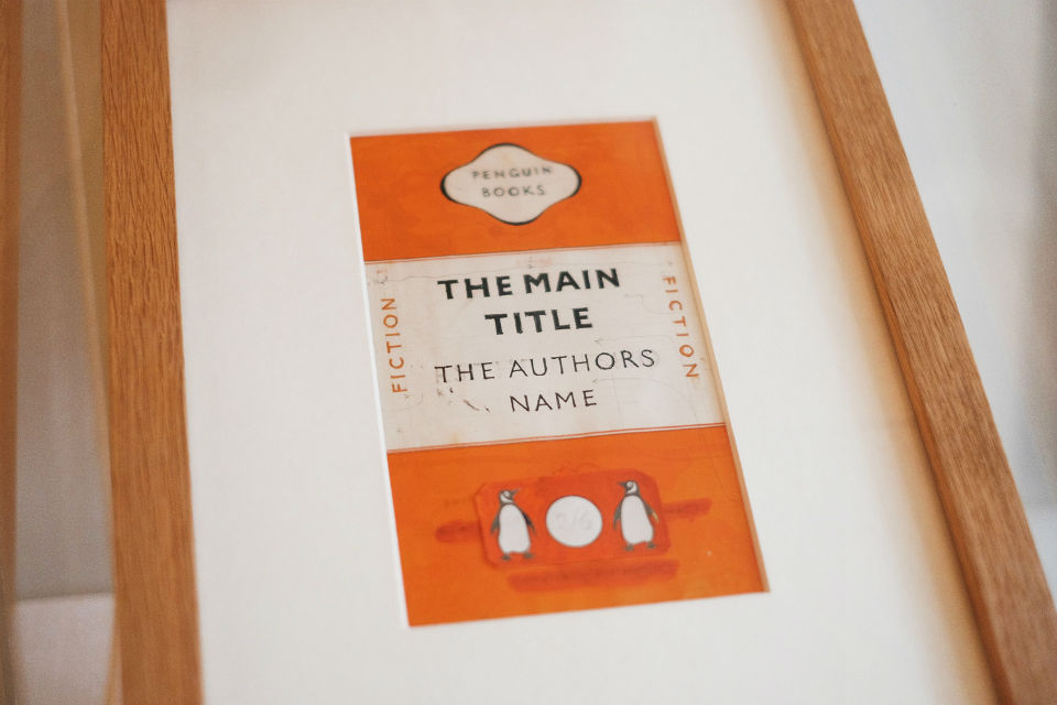
3. A hand-painted version of the famous 'tri-band' design
Jan Tschichold’s ‘tri-band’ grid is arguably the most famous Penguin cover design, today adorning mugs and canvases as often as books. You can see the original experimental layout in the exhibition, painted with Tschichold’s own hand and on loan from the Allen Lane archive at Bristol University.
4. The original Penguin Classics colour chart, organised by language
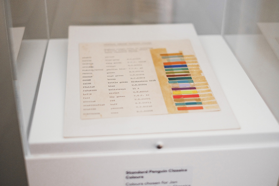
The colourful Pocket Penguins come in a range of striking colours - which might seem like a departure from the classic black books, but they actually have their origins in an object from 70 years ago.
The Standard Penguin Classics Colour Chart denotes a colour for each of the original languages that Penguin Classics were translated from. While some have remained the same (Russian, Italian and German) others, including Spanish and French, have new colours for 2016.
The exhibition is free of charge and is open on Saturdays and Sundays until October. For more information visit: isokongallery.co.uk