- Home |
- Work With Us |
- Cover Design Award |
- 2022 Shortlist |
- Adult Non Fiction shortlist
Adult Non-Fiction shortlist
Lilja Cardew - Winner
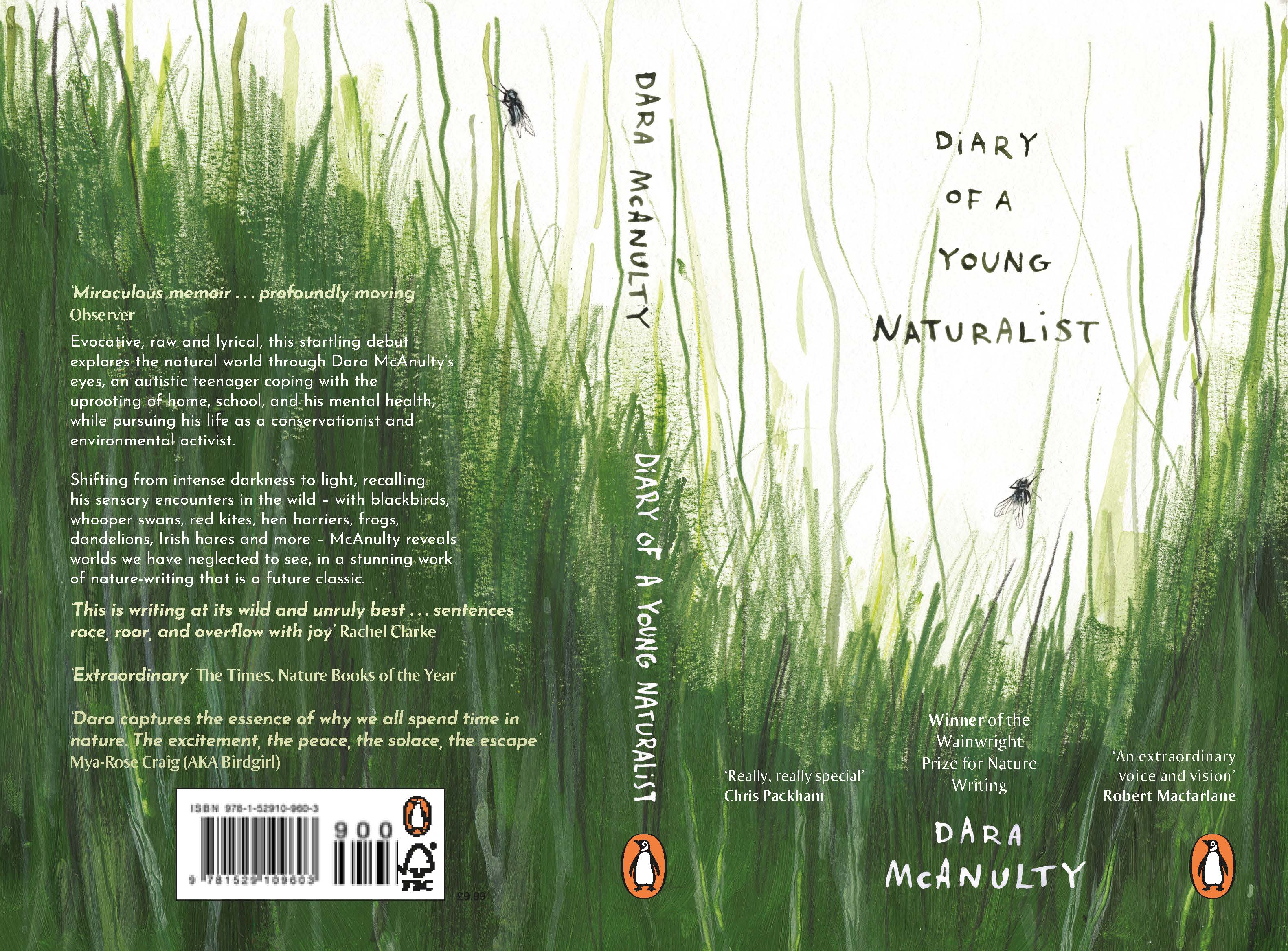
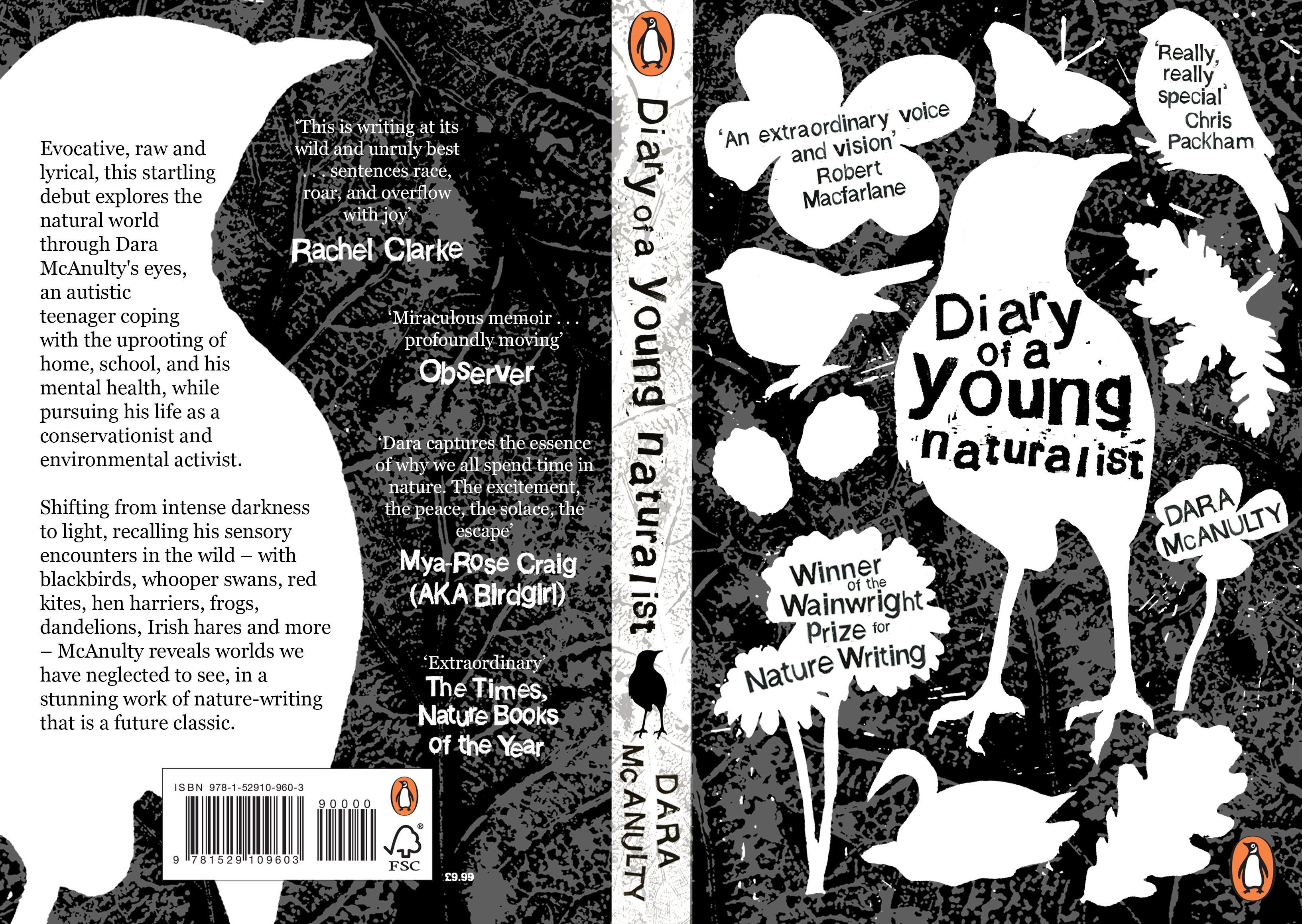
I kept coming back to the way the natural world around Dara was a grounding force for his anxiety. Lying in deep grass is soothing, at least to me. All the senses are heightened. The smell of the earth and grass. The rustling and crackling of the insects, yet intense silence rises from the soil. I relate to Dara’s attachment to nature, and the more I drew, the narrower the view became, until green grass represented the nuances, all too often overlooked that Dara writes about so beautifully.
Judges comments:
Lilja’s design has stunningly embodied the core of Diary by elevating what we see every day. The angle, which I have positioned myself in for most of my childhood watching insects and listening to every sound is perfectly captured here. There’s a special order about the design that really appeals to me, the lines have a wild logical sequence. I love it! Congratulations Lilja!’
Dara McAnulty
‘Huge congratulations. We all loved this cover. You can just imagine the author lying back - the smell of the earth and soil, the birds circling in the sky above and the insects resting for a while on a blade of grass. Making grass look so lively and full of life isn’t easy. The lettering feels personal and fits the tone of the design beautifully’
Suzanne Dean, Art Director - Vintage
‘There is something wonderfully calm and expressive about this design. Through the simplicity of its textures, the different shades of green and the loose pencil work, it has captured the essence of Dara’s writing – immediate, enchanting and grounded’
Harry Woodgate, guest judge
‘Loved the honest approach with this design. Simple, pared back, full of energy – it really encapsulates the story’
Jason Smith, Art Director - Cornerstone
‘This is such a confident, simple design. Being able to see the pencil mark texture creates and evocative feel of growing up in nature. I feel that Dara is down there lying on his stomach witnessing the wonders of the natural world at close range. A very worthy winner.’
Richard Ogle, Art Director – Transworld
‘I loved the connection to nature that comes through the textures and perspective of this artwork. Just so perfect for the book. And the naïve hand drawn lettering put me in mind of indie movies, which is perfect for the younger market we’d like to reach. Congratulations!’
Loulou Clark, Art Director - Ebury
‘I was impressed with the amount of detail achieved using very simple marks to achieve a bugs eye view of the world. Very clever!’
Nathan Burton, guest judge
Nancy Jackson - 2nd Place
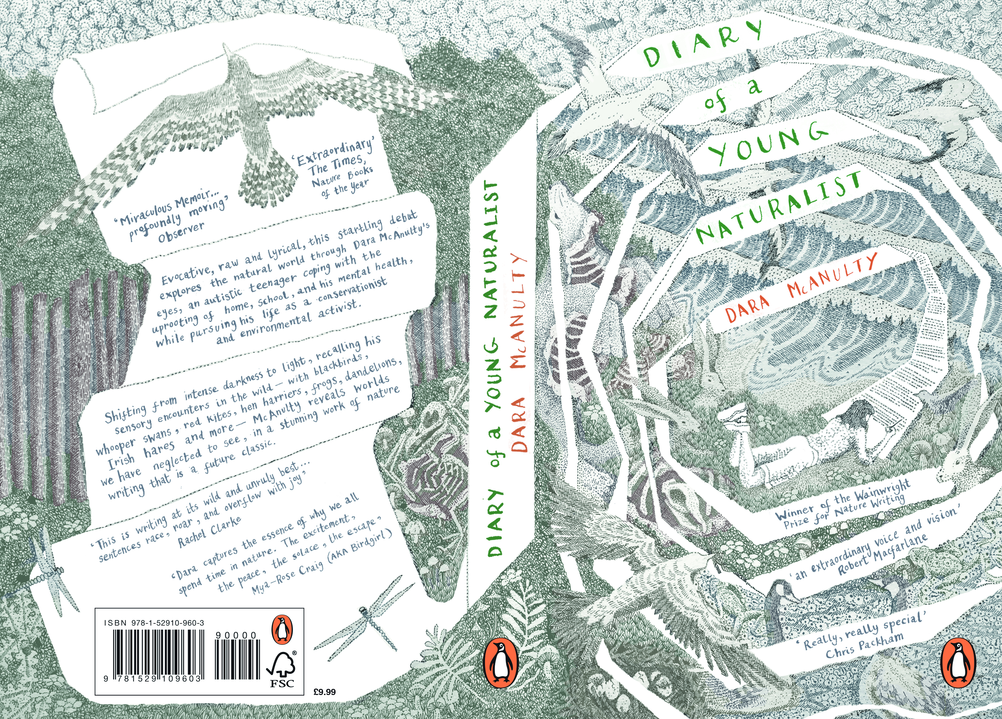
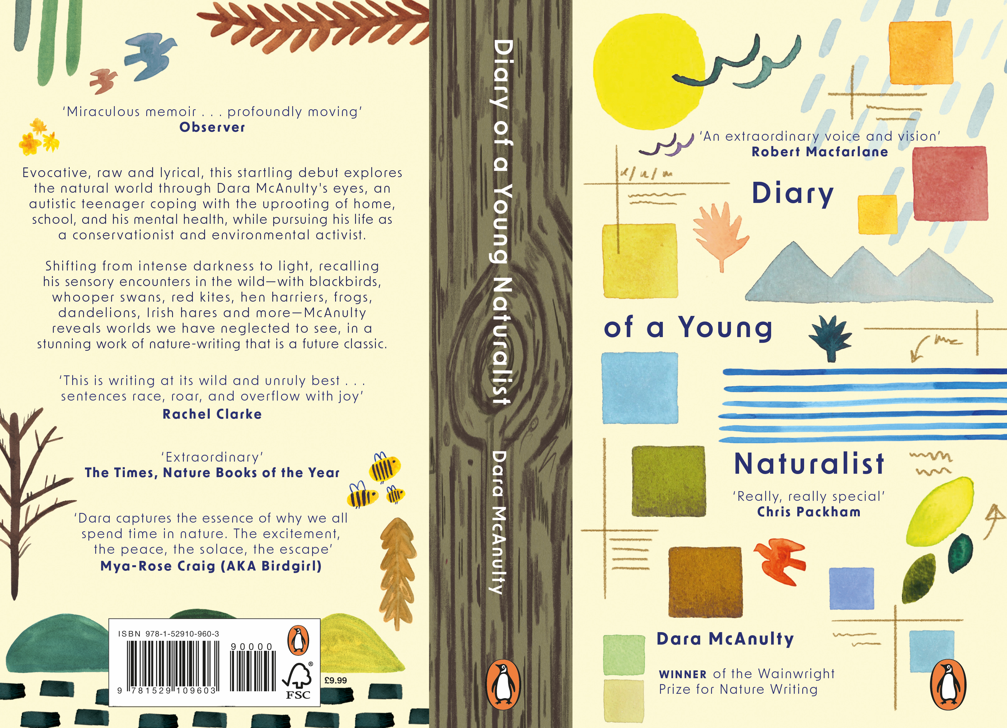
The cover drawing stretches full bleed with a gentle intensity to mirror the tone of the book. A coil of negative space intersects the drawing to represent a diary, and visually equates the power of the external world and the internal thoughts of the author. The simple hand-written text matches the intimate and charming style of writing — while the cover remains almost overwhelmingly complex, echoing the challenges of the author’s mind.
Judges comments:
‘I was so impressed with the intimacy of this illustration, the gentle tones and details. The design as a whole front and back cover is well considered. The letterings sits beautifully within the spirals of the diary. Congratulations’
Suzanne Dean, Art Director - Vintage
‘I absolutely adore the delicate, detailed illustrations of this cover and the way Dara’s diary has been incorporated into the design is captivating. It is a cover that really rewards repeat viewing and you can find more beautifully rendered elements each time.’
Harry Woodgate, guest judge
‘Such a fantastic design, had me transfixed form the moment I saw it. So many layers, I see something new each time I look at it. Amazing!’
Jason Smith, Art Director - Cornerstone
‘This is a beautifully realised illustrative cover that totally nails the content of the book and Dara’s character. We discover extra elements hidden in the illustration with every view, like Dara’s exploration of nature.’
Richard Ogle, Art Director – Transworld
‘What a beautiful cover! The intricacy and detail is just stunning but also such a well thought out, clever concepts. Dara’s thoughts unravelling on the page is a fantastic idea and it’s been executed with skill and care brilliantly’
Loulou Clark, Art Director - Ebury
‘I loved the level of detail in depicting Dara’s world. I thought the composition was very strong’
Nathan Burton, guest judge
Zofia Chamienia - 3rd Place
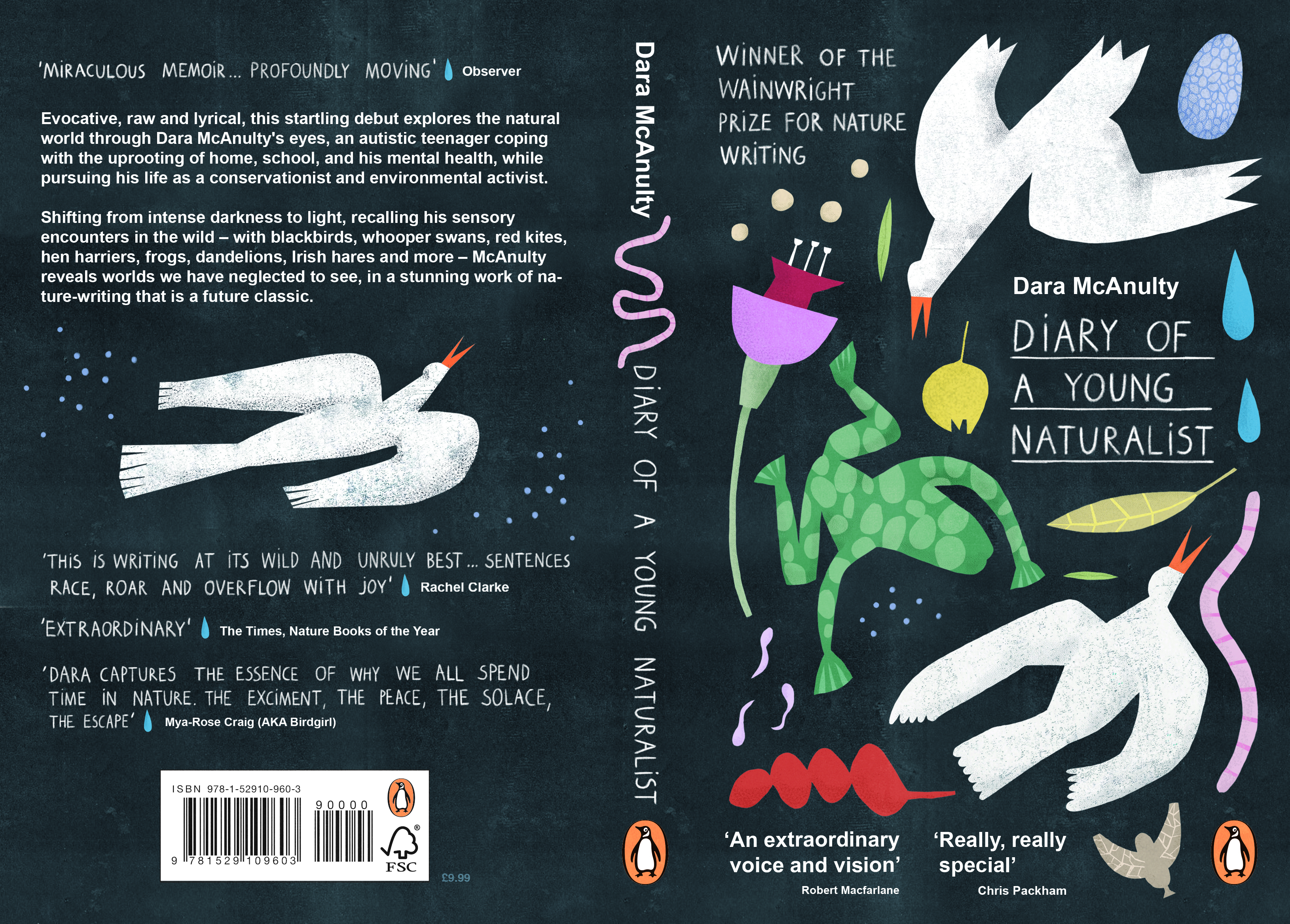
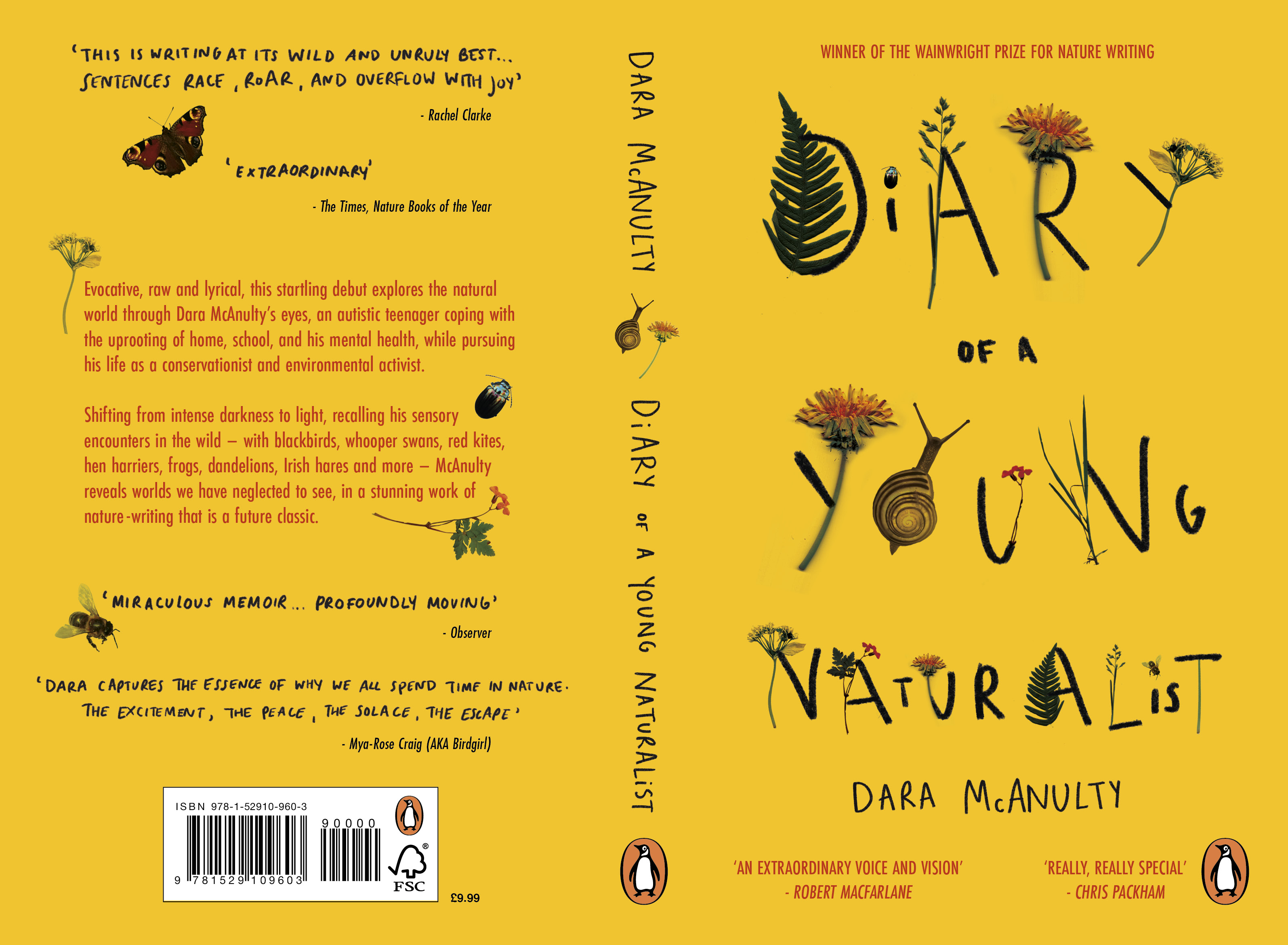
Before designing the front cover for Diary of a Young Naturalist I read this book, to have a better understanding of its topic, and the style of Dara McAnulty’s writing. Inspired by it, I decided to keep my design in a diary / notebook aesthetic to make it consistent with the style of narration in the book. In order to achieve that, I used handwritten typography, both on the front and the back of the cover. I designed a set of collage-based, nature-related elements and placed them on the front cover in an imperfect way, almost as if they were collected and strewn around. I wanted them to appear in a way that seems disorganised, to emphasise how we should understand and observe the nature around us, and not try to organise and change it.
Judges comments:
‘This illustration, a collage of natural related elements was stylish, handmade and appealing to all ages. The image pops against the bold black background and with hand lettering for the author and title, it suggests a diary or notebook. Congratulations on a beautiful design.
Suzanne Dean, Art Director - Vintage
‘There’s something so lovely about the organic paper cut shapes of this design, the bold colours and the detail of the underlined titles, which references the diary element. It feels clean and modern, and captures the spirit of the book very convincingly’
Harry Woodgate, guest judge
‘I love the execution of this design, it really brings the book to life’
Jason Smith, Art Director - Cornerstone
‘I like how the illustration style brings a youthful naivety without making it feel too young as a pitch or the book. It is dynamic and bold and well thought out.’
Richard Ogle, Art Director – Transworld
‘I fell in love with this cover. The colours, shapes, lettering, textures – everything all comes together somehow perfectly in Dara’s voice. Youthful but sophisticated. Fantastic job!’
Loulou Clark, Art Director - Ebury
‘The mix of cut out style of illustration and hand drawn type made this a very strong contender. I found the naïve style of illustration particularly charming’
Nathan Burton, guest judge
Ella Hunter
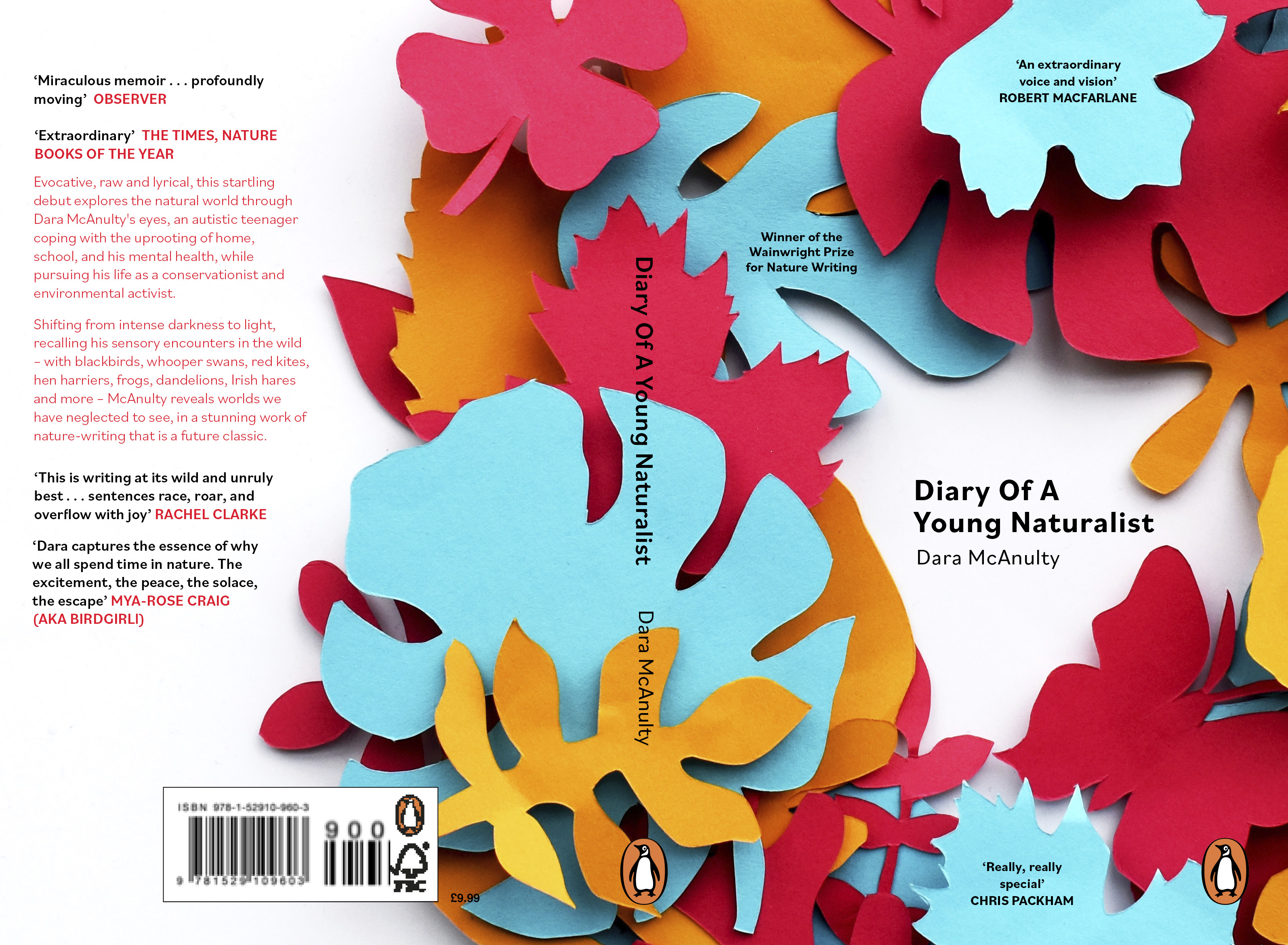
My concept for the book cover design was taken from Dara’s quote in the summer entry of the book “I often imagine a canopy of leaves above my head, protecting me from the world.” I wanted to capture this thought through my design. The foliage of the different coloured leaves represent nature and shaping them in a feminine shape like the circle shows how it shields, protecting Dara through each season, Spring, Summer, Autumn and Winter. My concept behind choosing the butterfly is gathered from the term ‘metamorphosis’. In the book Dara grows and adapts throughout the year showing the importance of change.
Chloe Law
When I was creating my design, I knew I wanted to include some of the wildlife that the author speaks about throughout the book. I felt that it was important to include wildlife on the front cover because of the author’s love of nature and how important it is to him. The blackbird, especially, was something that I knew I wanted to include on the cover, as it symbolised the author, something he talks about when saying his mum used to call him ‘lon dubh’, meaning ‘blackbird’ in Irish.
Ellen Nacey
I drew upon multiple quotes within the book for my design. For example, ‘… an ocean of fertilised fields, the luminous greens, contrasting with the rugged mountain, and the patchwork of birch leaves in Dutch and orpiment orange.’ is vivid, evocative and beautiful. Dara’s words come alive off the page, and they felt natural to visualise. I adored how Dara wrote about shape, colour and form within nature. The cover comprises watercolour illustrations of natural elements, colour swatches and notes alongside a tree trunk ‘spine’. It is his observations that capture the magic of the outside world that make this cover what it is.
Annalie Pearson
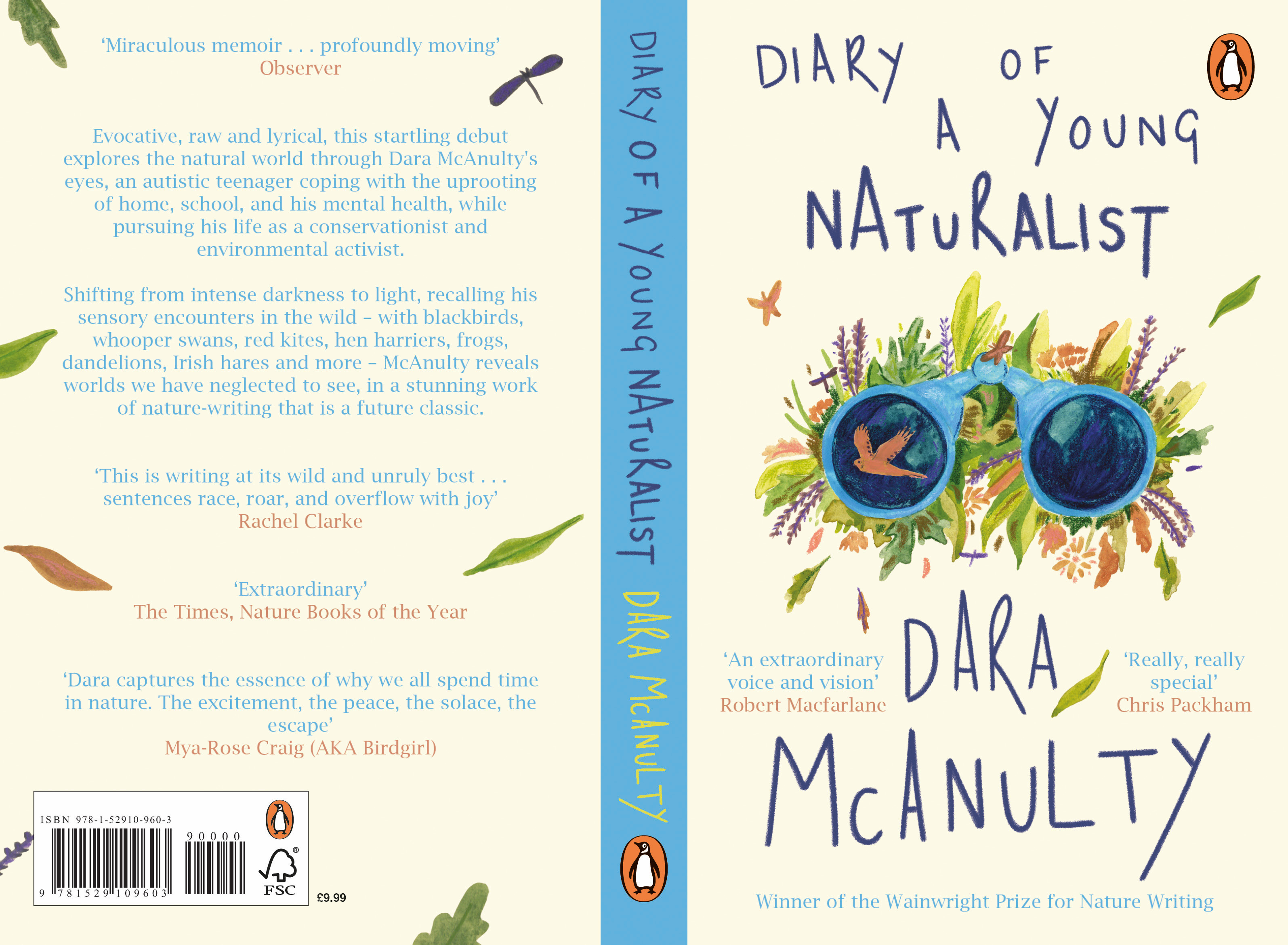
The book gives the reader an insight into how the natural world looks through Dara’s eyes, and I wanted to emulate this in my design. This motivated the idea to make binoculars central to the illustration. The personal journey Dara goes on from a childlike love of nature to a fierce determination to make a difference, played a key part in my design choices. I kept the overall style playful while the central composition of the illustration represents Dara’s unwavering focus on nature.
Grace Reeves
The idea behind this cover design is to reflect the text's nature of being a diary, using scribbled textures and handwriting. By combining this with imagery of ferns, dandelions, wild garlic and more, the cover aims to illustrate and emphasise the importance of nature within Dara’s life and diary entries, intertwining the natural imagery within the handwritten typography. The type is raw with each letter unique, using the imagery to create a sense of cohesion across the cover and reflect the author’s comfort in patterns and repetition.
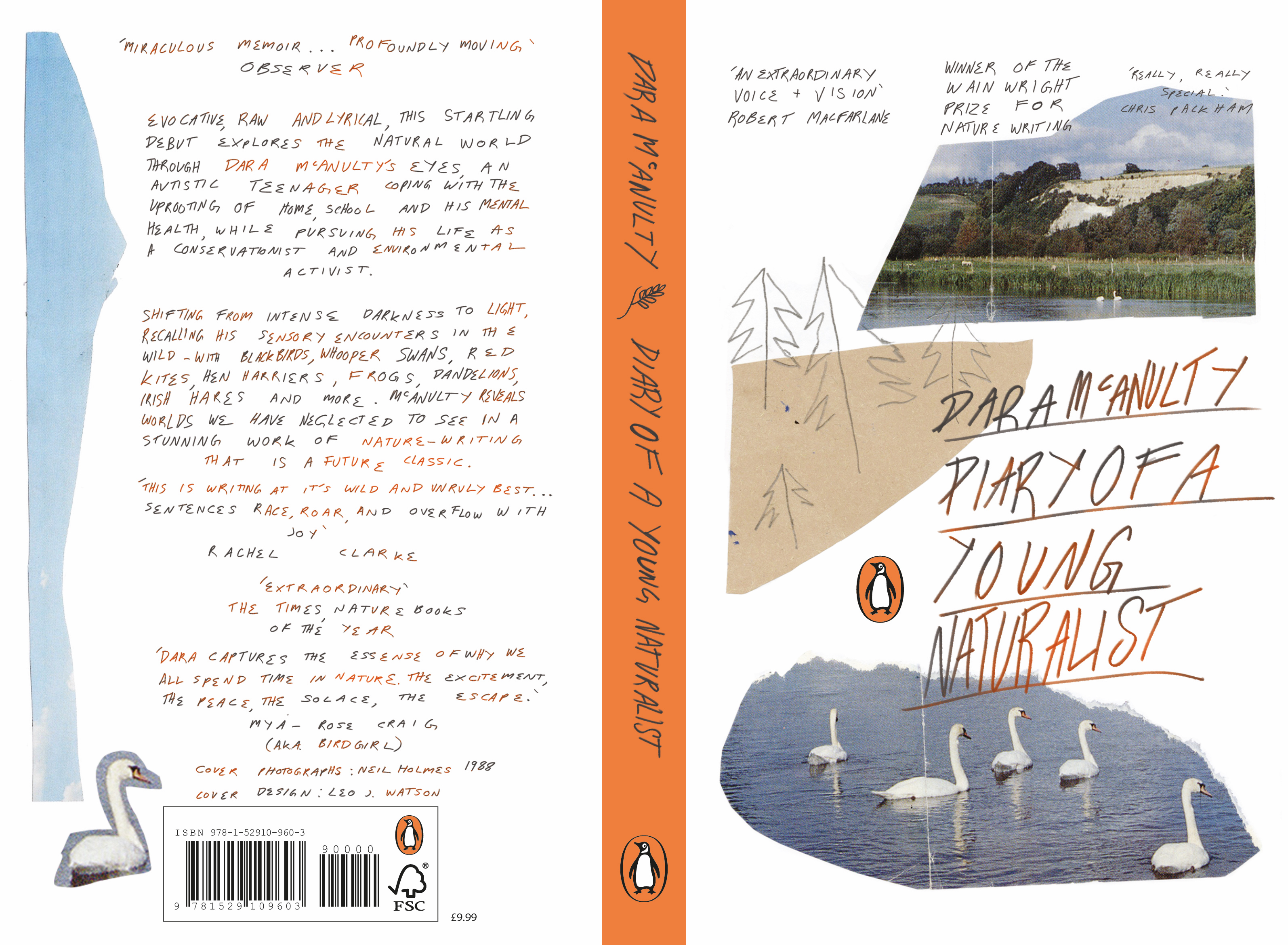
Leo Watson
Reading the book, I felt an overwhelming sense of connection. Dara’s writing, open in its diary format, reaches out to the reader. I wanted to channel that into the cover. I decided to explore a handmade style, flipping through 80s nature magazines to find photos to tear up and collage together. I think collaged textures and scribbly typography can often be more approachable than clean, polished work. Nature and the humanity we can explore in nature are not sanitised, and they don't need to be.
Kitty Wilcox
I wanted my design to evoke traditional woodcut illustrations; with their warm organic textures, unfussy line work and flat, folksy perspectives. I did little preparation and instead tried to create instinctively, hoping I could imbue a little of the naivety that made those woodcuts so charming. Dara’s writing is so rich, it felt only right to reflect this by filling my design with as much life as possible; animals, plants and fungi wherever you look. His writing shows a deep love for the natural world, and I hope I have expressed my own love for it through my creation.