- Home |
- Search Results |
- Malibu Rising: How we designed the cover of Taylor Jenkins Reid’s new book
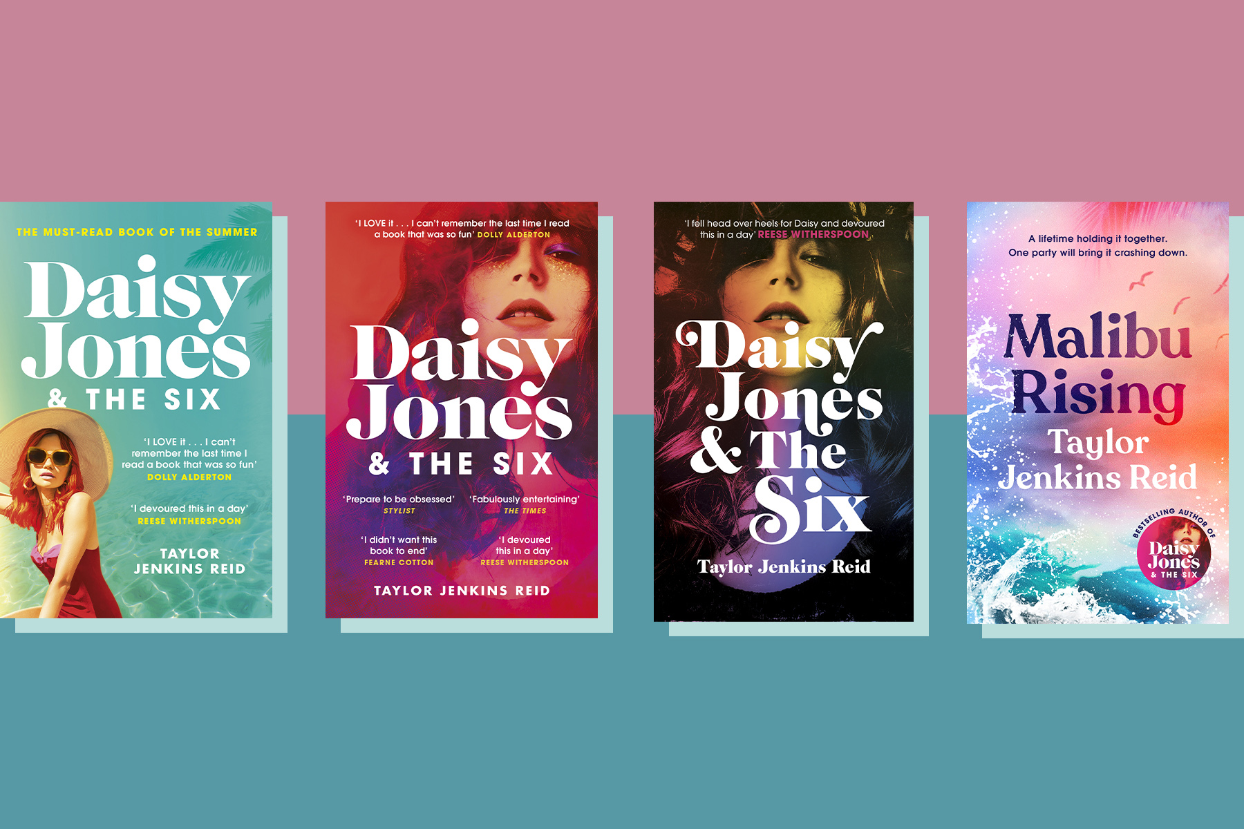
There was a while when the cover of Daisy Jones & The Six felt as famous as its fictional rock star: the gap-toothed pout and tumbling curls of the rainbow-coloured woman on the front of Taylor Jenkins Reid’s novel popped up on Instagram and in bookshop windows alike.
Fast-forward a couple of years and Reid has traded the hedonism of the 1970s for the excess of the Eighties. Malibu Rising re-invents the family saga, hopping through time to climax in one freewheeling evening, when the four beautiful and glamorous Riva siblings – models, photographers and pro surfers – collide with devastating effect.
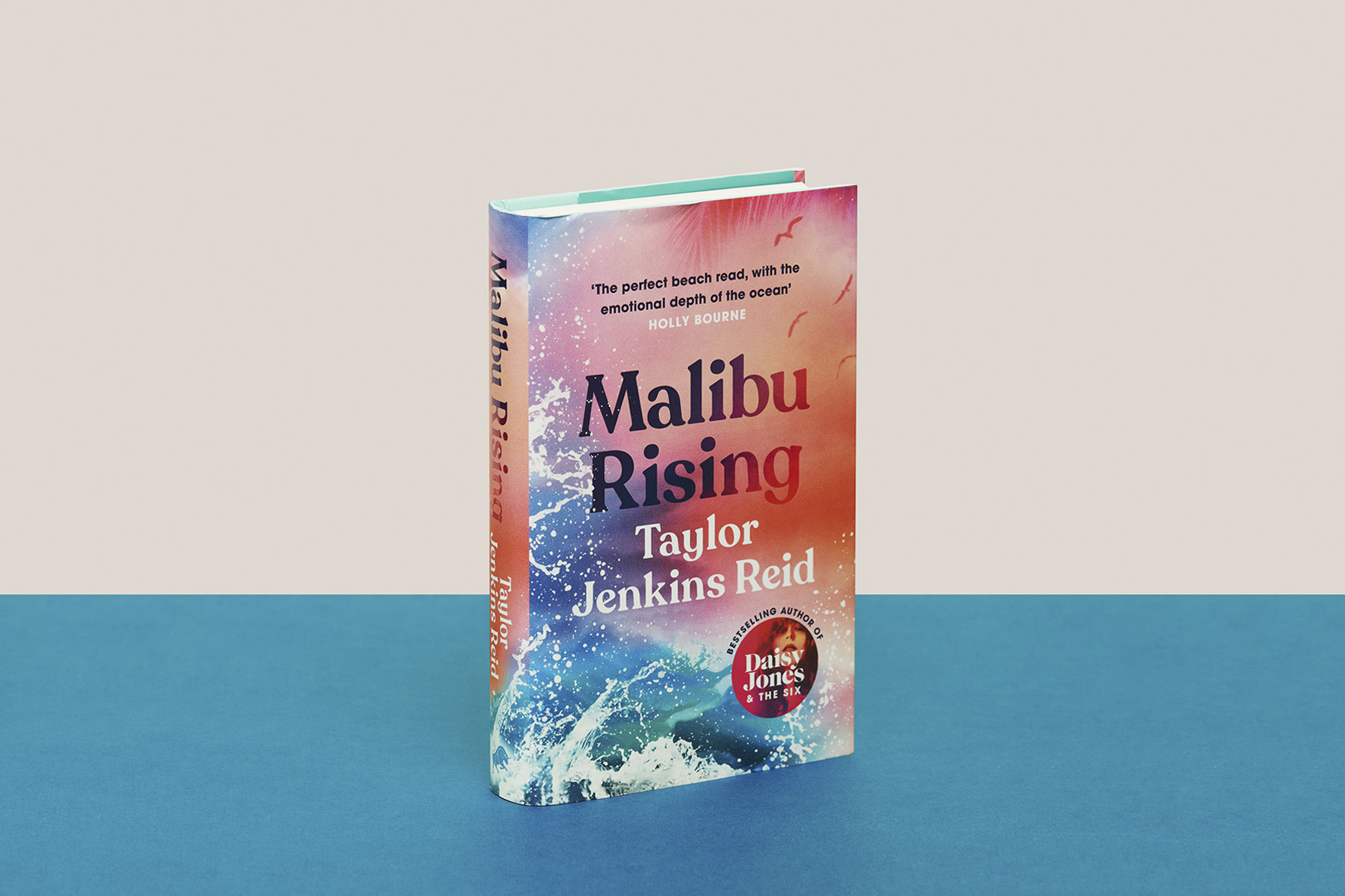
Daisy Jones & The Six ended up with three different covers: one for hardback (designed by Lauren Wakefield), two for paperback – and Henry Petrides, Senior Designer at Cornerstone, created most of them. He also created the dreamy seascape that introduces the reader to Malibu Rising.
'There were some versions which were more lurid, they started to look like old Athena posters'
“I started working on it in the very first lockdown, and it was a nice way of escaping an April trapped inside – looking at loads of pictures of amazing beaches and sunsets and stuff,” he jokes. The Pacific Ocean – and its nearby Pacific Coast Highway is a consistent backdrop to the events of the novel. Reid’s characters wake up to it, bond in its waters, escape their troubles on its waves and betray one another on its shores. The house they grew up in was literally on the beach, the source of the sand that gathered in bathroom.
Petrides knew he wanted to evoke the Eighties at a glance with Malibu Rising’s cover, but finding the right references took some research. “There were some versions which were more lurid, they started to look like old Athena posters,” he says. “A bit too Eighties! So I stripped it back again.” He looked to the colourful abstract portraits airbrush artists Peter Sato and Richard Bernstein, who portrayed stars such as Madonna and Grace Jones in bright hues. “I wanted to infuse the cover for Malibu Rising with a similar soft-focus quality and vivid colour palette,” Petrides says.
The result is something candy-coloured and dreamy; I tell Petrides that the combination reminds me of the bike my mum rode in the late 80s. “Yeah, exactly! That’s what I was really trying to do,” he says, referencing a cartoon from the era called Jem and the Holograms. “I became obsessed with it years ago because it’s really camp and silly but also has an amazing colour palette – the pink and the turquoise were guiding me.”
Some earlier designs referenced Jenkins’ characters more specifically, with the face and the figure of a blonde woman – central big sister Nina – but in the end, the waves were left to speak for themselves, with the silhouettes of four gulls in the sky representing the four Riva siblings.
What makes Daisy Jones & The Six and Malibu Rising look somehow related themselves, I’d argue, is the typeface on the font: serif and imposing, both titles and author names are irresistible on the covers. “It was hard to find a font that had an Eighties feel but wasn’t too techno or neon,” says Petrides. “Originally I was looking at that 80s handwritten scrawl and tried some hand-painted things, but it looked too much of a pastiche. In the end, I found this one which linked to Daisy Jones but isn’t quite as , but it's not the same, but it's not quite as Seventies, and has its own character. The serif just made it feel a bit warmer.”
Finally, Petrides added one final touch: “I decided to have the flaps and the endpapers in a similar tone of turquoise, so that when you opened the book it was as if you had plunged in to the ocean that foams at the bottom of the jacket.” Surf’s up!
Taylor Jenkins Reid was a guest on The Penguin Podcast this week. Listen to her interview below.