- Home |
- Search Results |
- ‘Exploring nature has never been more vital’: designing Ladybird’s ‘What to Look For’ books for a new generation
‘Exploring nature has never been more vital’: designing Ladybird’s ‘What to Look For’ books for a new generation
Sixty years ago, Ladybird’s nature books for children inspired a generation of naturalists. Here, we speak with art director James Stevens about the challenges of updating the iconic series.
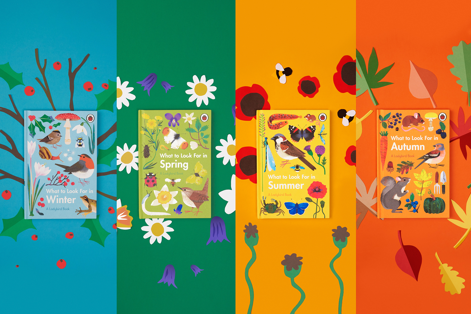
In the late 1950s and early 1960s, Ladybird released a series of four nature books for children under the name What to Look For: one for winter, spring, summer and autumn, tracking the seasonal changes that occur in the British countryside. Between the books’ message to explore the world around us and painter Charles Tunnicliffe's gorgeous renderings of nature, the series became iconic. For generations, the series inspired and nurtured the outdoorsy passions of burgeoning naturalists.
Over 60 years on, though the books look as beautiful as ever, their subject matter has changed: climate change and urban sprawl have altered the landscapes and wildlife that flew, swam, and crawled around the pages of the original What to Look For books. When James Stevens was appointed art director at Ladybird, it was one of the first series he turned his attention to.
"We knew before we’d started that it was so important to rewrite these to reflect today’s world”
“Reading the originals and realising that the world has changed, and that climate change is moving seasons on, we knew before we’d started that it was so important to reflect today’s world,” Stevens says now. He and his team began thinking about the role the “quintessentially British” books needed to play in today’s UK.
“We thought, ‘What do children need today?’ Obviously, we needed to bring [the series] back for today’s audience – update and refresh it, an alternative to the internet that still provides bite-sized information; a build-your-own encyclopaedia for the home. A nod to the classic format, for today’s audience.”
Beloved for their sense of wonder and exploration, Stevens knew, despite the changes the natural world had undergone in the last half-century, that the series needed to indulge in the beauty of nature. Charles Tunnicliffe had made the original series iconic, so “art style was an early thought,” he says.
“When we looked at the project it was a dream brief, really. We knew it was a job we had to do right, so we thought, ‘What type of illustration would appeal to today’s children?’”
Stevens briefed the project out to four different designers. "They all approached it in different, exciting ways. Then we got feedback on a large scale on which resonated with children more than others; we wanted to go into schools and get the information first-hand.
"It was eye-opening: you might have an idea in your head about which images would resonate with a child, but until you actually see them picking things up and asking ‘Why have you picked that up?’ you don’t really know. The children always gravitated to the colours: ‘This one’s more colourful, more exciting!’
“We showed them illustrations of trains for a different book, and we thought they’d love the old trains, like the steam train from Harry Potter, but they wanted the more muted, modern-looking trains, because they had been on trains like them before. Their thought processes dictated the directions of the illustrations here.”
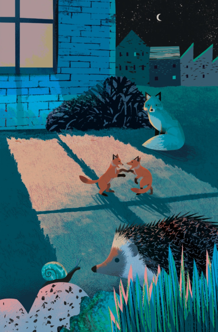
Once they settled on the design ideal, they began the search for the perfect illustrator, who could straddle the line between scientific reality and aesthetic boldness and beauty. They found Natasha Durley.
“It’s a fine line. When we were looking for an illustrator that would have that bold, colourful appeal but still be factually correct, Natasha’s work stood out. It had such charm and appeal to it; it has a little character to it, without straying from reality. It was a tough search, because these books are so well-known. We knew there would be interest and lots of fans of the originals.”
Asked whether there was a mood or tone communicated to Durley in the brief, Stevens says that while “we knew we could be playful with the scenes, we had to be quite specific about what she needed to include.”
The books include a significant amount of information about the natural world – differentiating between specific bat species at one point, and between plants like hellebore and Dog’s mercury at another – so “the reference material was endless.” In the end, he says, “it was a collaboration between Natasha’s instincts and our direction to get the right result. The starting point was a couple of pieces from her portfolio where we said ‘This is what we’re aiming for.’”
The end result is four books that reflect the changing world of the UK, both out in nature and in cities – the new books made a conscious effort to reflect the diversity of the UK’s people as much as its wildlife: “We try to reflect society in every book we do; it’s an ongoing mission of ours,” says Stevens – but which uphold the objectives of the original series: to foster an appreciation of the natural world in a new generation of children.
“All of the text was re-written, and there’s still a lot of information, but we didn’t want to just think of adults who might be picking these up; it was key that children be excited to read these and pick them up themselves. The books encouraged children to go out and explore nature, and that’s never been more vital than today.”
What did you think of this article? Email editor@penguinrandomhouse.co.uk and let us know.
Image: Stuart Simpson / Penguin